College Dorm Reveal: A Classic Contemporary Design

College Dorm Reveal: A Classic Contemporary Design

“ Some girls were just born with glitter in their veins.”


Creating a stylish college dorm design scheme doesn’t have to break the bank, especially when using basic dorm essentials from retailers and hiring a designer to pull it all together. In just a few weeks and a bit of online shopping… options were sourced and decisions could be made in time to install before the start of school. This recent dorm design won the Dorm Decorating Competition at UVA!


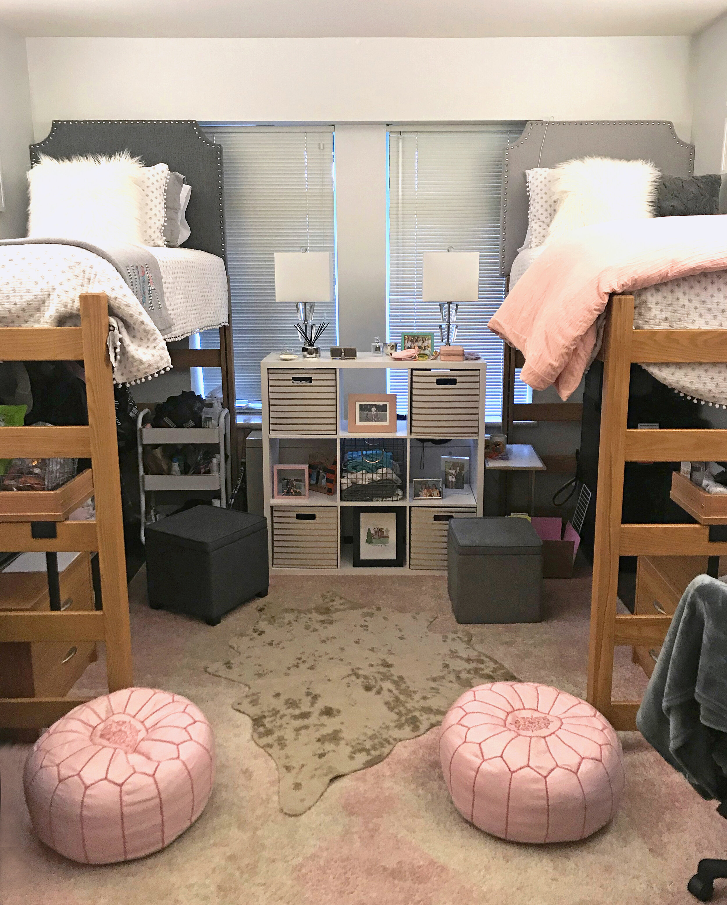
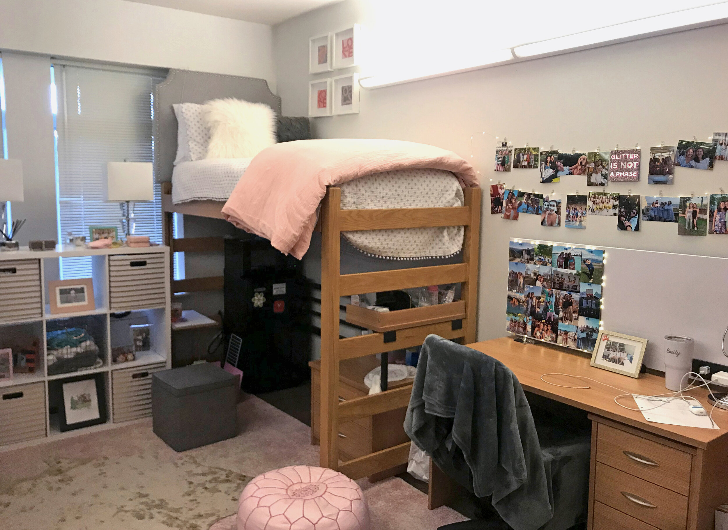
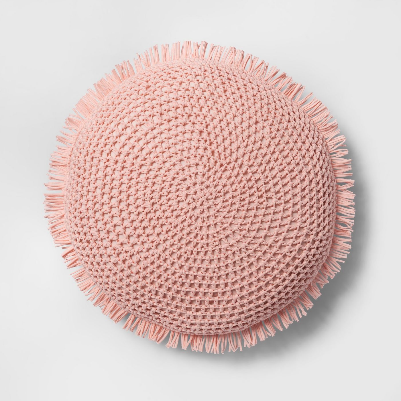
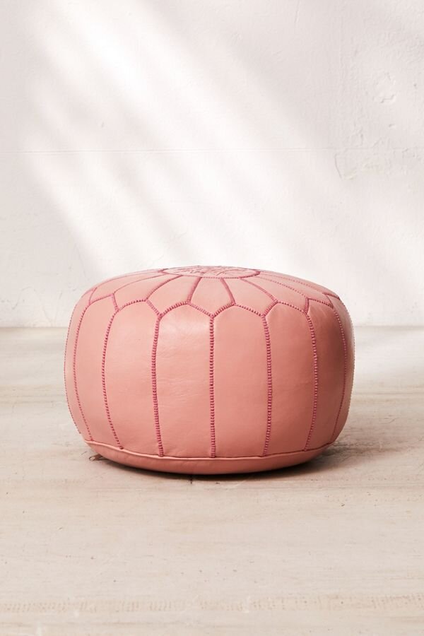
By adding elements of contemporary style with acrylic base lamps and layering these rugs. You can see how these added touches make this dorm room sparkle. The headboards and bedding have a more sophisticated look to bring in a little bit of chic and yes the rose pink leather moroccan poufs are like icing on the cake.

EmDorm4.jpg


We love to infuse local artist work into our clients spaces and this client happens to love Sunny Stack Goode artwork. A perfect way to personalize and inspire creativity while studying or hanging out. The client’s mother found these Lovesquare prints which blended into the design perfectly and gave that special touch from Mom.

LOVESQUARE PRINTS


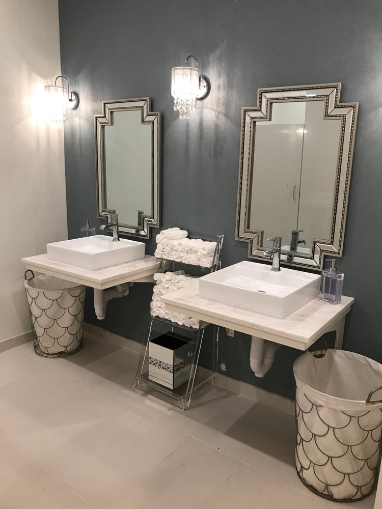
dorm room essentials

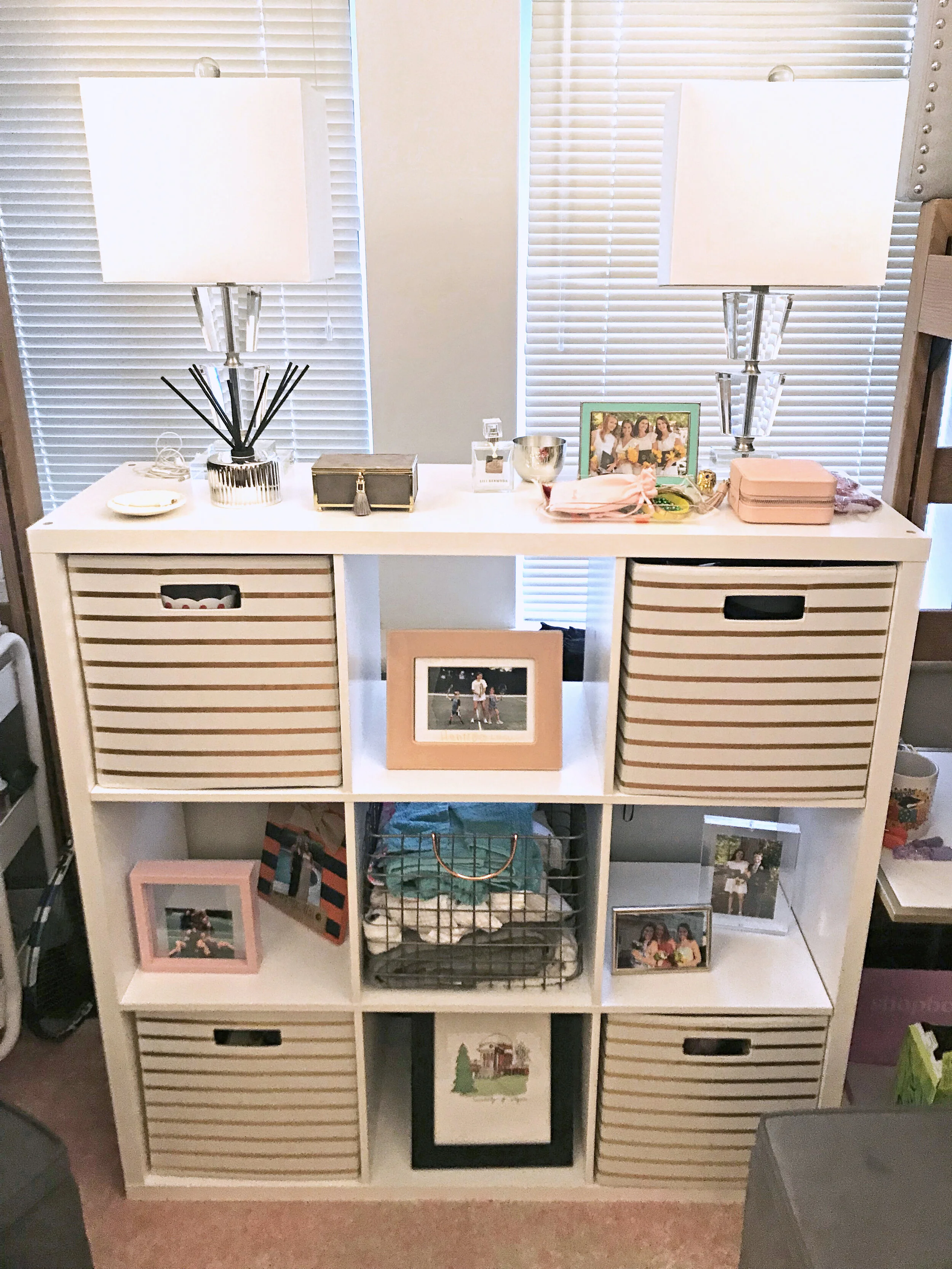
In smaller spaces it’s important to have lots of creative storage to keep things tidy. This book shelf is classic white and the gold striped bins at a contemporary touch.

Framed pictures and photo collages are a special way to keep memories of friends and family close while being away during the year. A great way to also remember to pick up the phone and give them a call to say hi once in a while too.


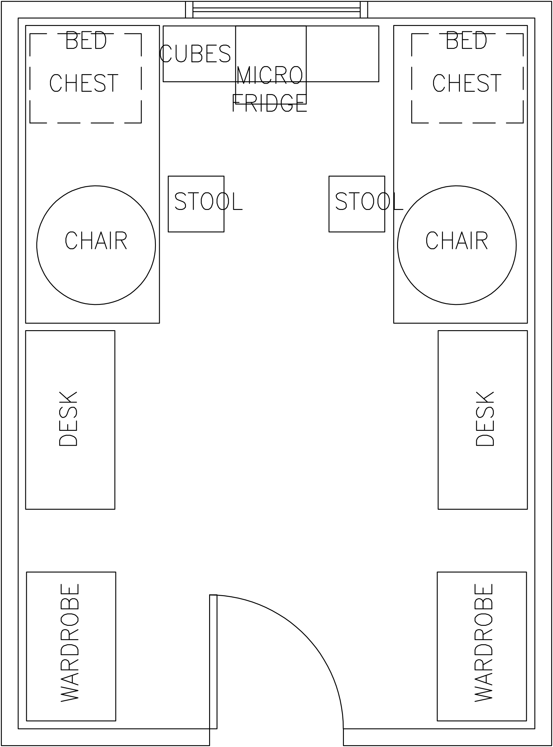
A room schematic helps provide scale and a sense of space

By drawing out a room we show clients ways to maximize their space. This is also helpful to have during move-in or install day to easily place things. Make the most of your room by planning out the placement of furniture storage and seating. We like to measure out rooms to ensure the spacing of furniture is just right and to also find the right size we’re looking for.


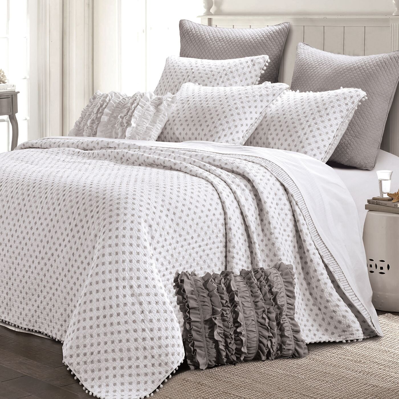
Layering bedding is not only stylish but practical, especially in different climates or seasons. By having a balance in the patterns and textures it delivers a thoughtful sense of design that isn’t an overwhelming theme. We love these subtle colors that bring a calm but still girlish feel to the room. It’s o.k. to still love polka dots and ruffles too just in a paired back way.

CONTEMPORARY ACCENTS


We’re so excited that our client loves their new space. It was so fun collaborating with the student and her mother as we combined their finds together to create a home away from home. Hearing they won for best dorm room design is also pretty amazing too.

Cheers!

Melissa Mathe

Contact us for all your Interior Design and Decorating needs @mathedesign.com

A Refreshed Crisp Classic Kitchen: Grab Your Apron

A Refreshed Crisp Classic Kitchen: Grab Your Apron

"A party without cake is just a meeting" ~ Julia Child

Photography by Ansel Olson

Photography by Ansel Olson

The Mathe Design team got a call for a kitchen renovation and we were pleased to find a nice space that needed some life brought back into it. This previously 90's style kitchen had natural wood stained cabinets which were beginning to fade and sag. Functionally it worked, but yet not as well as it could. So we grabbed our aprons and got to planning.

The homeowner was interested in a kitchen that is fresh and clean, but also warm. We settled on a clean white cabinets and warmed them up with matte black jewelry - I mean hardware. 

beforepicture_cabinetsfnl.jpg

Before Pictures

Photo Mar 06, 12 21 46 PM.jpg

We closed in the doorway that led from the kitchen to the dining room. The dining room had another adjacent entry, so by losing this door we were able to grab more lineal square footage for the kitchen while maintaining access to the adjoining dining room.

We settled on a U-shape design that increased their counter and cabinet space. It was a little adjustment getting used to the idea of no island - and so far nothing has been placed/dropped on the once-upon-an-island space where a rug adds warmth to the room. 

Photo Mar 06, 12 23 35 PM.jpg

With our clients desiring an updated transitional style we sourced lighting from Currey & Company, Visual Comfort and Arteriors Home in a beautiful silver toned finish. Keeping the themes of fresh and warm in mind, we used large lighting to create a sense of space within a space and intimacy. The large pendant over the table gives definition to the eating zone, while the large semi-flush defines the prep/work space. Additional recessed can lighting properly lights the space for prepping without taking away from the focus on the main decorative fixtures. All the lighting is dimmable for flexibility in light levels depending on how the space is being used. 

We finished out the kitchen adding a fresh and warm tile backsplash that adds texture but is easy to wipe clean from Ceramic Technics. And grounded this delightful space with an exciting blue pearl royal granite. That creates contrast against the clean white cabinetry as well as adding warmth. 

This once outdated kitchen is bright, fresh and a perfectly inviting place for our clients family to come together. Can't you just hear the dinner conversations in this space....

Melissa Mathe

Contact us for all your Interior Design and Decorating needs @mathedesign.com

Spotlight On Commercial Design: The Bar Method Richmond

spotlight on commercial design:
the bar method richmond

"Keep your heels, head and standards high." ~ Coco Chanel

Bar Method Wall_Counter.jpg

This past May of 2017, The Bar Method of Richmond opened it's doors to welcome barre babes to get fit while tucking and shaking in their new studios.  We couldn't have been more excited to jump at the opportunity to be a part of this Commercial Design project.  While working with the owner, Nicole Davis, we developed a bold and chic design that both met the owner's personal style and also met the requirements within the national brand.  The dramatic entrance of the lobby area is anchored with rich dark floors, a bold striped feature wall behind the welcome counter and lit to perfection overhead with an over-sized black chandelier.  A stylish way to start a workout any day of the week in our book.

Located on the Three Chopt Road in the Village Shopping Center, near the University of Richmond - conveniently situated between Carytown and Patterson Avenue.  This is a great location to get to from any part of the local Richmond Virginia area.  In working to design a commercial space there are several key players that come together to make a project like this come to life.  In this case the owner, commercial general contractor and his team, along with us at Melissa Mathe Interior Design worked together to keep the project scope and opening date in focus.

The lobby space is complete with a sophisticated seating area for clients to relax before and after classes.  Featuring a tufted sofa, glam end tables, acrylic chairs and chic graphic elements on both the throw pillows and rug.  Attendees are welcome to grab a cup of water or coffee and shop the retail boutique section filled with barre merchandise professionally displayed.  All the activewear, water bottles and totes a fitness goer can utilize... situated on racks, shelving and mannequins displayed in the front window.  Seeing the dream of this commercial space for the owner, Nicole Davis and the instructors come to fruition is quite a thrilling and rewarding experience for us. We appreciate hearing positive feedback and were pleasantly surprised to  read this response from one of The Bar Method clients on their social media.

spacegraphic2-01.png

"Stopped by the @barmethod_richmond this morning. Such a pretty studio and a cute boutique in the front!
Oh yes, and a definitely solid workout." ~ Megan Marconyak

Bar Method Studio.jpg

The palette in the studios is minimalistic and clean to create a sense of balance and not detract from all those raised heels and concentrated long holds going on during class. Special added touches in the locker-changing area and bathroom were installed with modern lighting and sparkling wall covering.  Set to give everyone a little feeling of pampering while getting a workout in at the start or end of their day.

We hope you enjoy seeing this commercial design space as much as we have being a part of it!

To learn more about The Barre Method studios, owner and instructor Nicole Davis and why this workout is so special check them out here.

Cheers!

Melissa Mathe

*For all your Commercial Interior Design needs contact mathedesign.com

A Bright French Bistro Kitchen: Bon Appétit

a bright french bistro kitchen: bon appétit

"The only time to eat diet food is while you're waiting for the steak to cook." ~ Julia Child

Photography Credits: Ansel Olsen Photography

Photography Credits: Ansel Olsen Photography

With each of our clients we have a special opportunity to create a space that is completely custom made for them. This project started out with an older chopped up kitchen and has now been transformed into a family-friendly open kitchen with a french bistro feel.

Photography Credits: Ansel Olsen Photography

Photography Credits: Ansel Olsen Photography

As you can see in these before and after photos two walls and a doorway were removed to create a more open kitchen layout. By taking down the main wall separating the original space and adding this beautiful custom island it opens up the kitchen and adds more usable counter space. Creating fluid areas for morning routines and coffee conversations. The unique custom built shelving systems were inspired by the owners and fabricated by the contractors to suit the organized coffee station, displays, and for additional light filtering. 

Photography Credits: Ansel Olsen Photography

Photography Credits: Ansel Olsen Photography

Classic french bistro kitchens are filled with blacks and whites with natural finishes. Leathered Granite perimeter counters in a dark color with white cabinets combined with a honed granite that mimics a classic carrera marble, but with additional durability, on the kitchen island with darker cabinets give a sense of the "French Bistro" feel our clients were looking for. The existing paneling was salvaged and painted white along with maintaining the original fireplace for added character. Bright and airy white paint connects the newly opened up butlers pantries to the main room as well as the matched dark iron pulls, making the kitchen more cohesive. This space is sure to be the topic of conversation during future entertaining and dinner parties!

Using a custom contractor we were able to reuse existing cabinets that were combined with new cabinets - made to match existing. A true craft. We were also able to truly customize cabinets for the client. Under the range you will find open drawers to easily locate that particular pot - and in the butler's pantry a base cabinet was transformed into a space for those dog bowls. No more sliding around the floor and water being sloshed all over. 

The integral team who worked in conjunction with the clients on this remodeled kitchen space include; Interior Designer: Melissa Mathe Interior Design, LLC, Architect: Melissa Vaughan, Construction Design: Chopper Dawson.

We hope you enjoy seeing the incredible transformation of this kitchen space!

Melissa Mathe

Contact us for all your Interior Design and Decorating needs @mathedesign.com