Mother Nature's Colors

Mother Nature’s Colors

"Nature always wears the color of the spirit." ~ Ralph Waldo Emerson


As you look around your home you may have “that space” – the room that needs an update, but you don’t know where to begin. You spend your evenings pinning rooms on Pinterest and browsing hashtags on Instagram. There are so many great ideas out there – how do you pick the right one for you?

The term “Natural Color” originated in the film industry in the 1930’s, but today it means colors that are found in the world around us. Take a moment to look out your window - nature gives us color palettes to jumpstart the design of your space. In Richmond we have so many rich flowers outside our windows that make a seamless transition into your home. We also have the James River and the natural habitats found along the river.

MotherNaturesColors_Beach.jpg

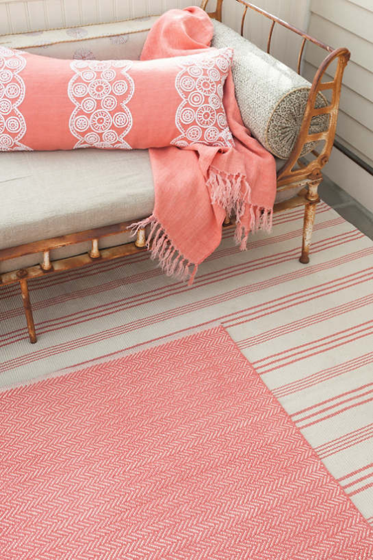
The beach is a buffet of color inspiration – it provides us a sense of calm and respite. The sand beneath your feet is textural speaking to all your senses. It’s not just “beige” – it’s a multitude of whites, golds, greys, and beiges, too. A way to accomplish this is to layer chunky fabrics with smoother finishes – linens and sisals.

MotherNaturesColors_Sunrise.jpg

The sunrise – a fresh start. You watch the waves rolling in as the sun appears bringing the first touches of light to the day. The blues, reds, and oranges provide a color inspiration that mesmerizes the eye and mind with an optimistic fresh and cheerful presence. Serenity with a touch of excitement. Pull in fabrics that are patterned filled with splashes of color. While every space should have a touch of texture, using fabrics that are soft to the touch will play off the colorful patterns.

MotherNaturesColors_Black-eyedSusan.jpg

Through the summer heat, the Black-eyed Susan brings color to our garden.  This flower has a happy warm color with its golden hues supports other colors in its midst and fulfills the desire for playful expression. This offers a feeling of happiness and joy. Mixing large scale and small-scale patterns with bright happy colors will have you feeling joy every time you walk in.

MotherNaturesColors_Hydrangea.jpg

This is the south and one flower that is signature is the hydrangea. There is simply no such thing as too many hydrangeas! The Limelight and French blue varieties are classic addition to any local landscape. The French blue hydrangea is vibrant with blues and regal purples with the bright green leaf. Soft colors in classic textures of linen with a hint of velvet and your space will be classic and warm. Your dinner guests may never want to leave!

MotherNaturesColors_Caesalpinia.jpg

I recently saw a Caesalpinia and immediately had a sense of a firecracker filled with anticipation. This flower is wild, bold, and daring. Deep hues of reds paired with all ranges of calming greens will have you bursting with excitement.

We are so fortunate to live in a town where our space around us is filled with color palettes, especially in summer. I challenge you to look out of your window and see what kind of color palettes your home is asking to be brought inside.

Cheers!
Melissa Mathe

Contact us for all your Interior Design and Decorating needs @mathedesign.com

Color Inspiration: Living Coral Pantone Color of the Year 2019

Color Inspiration: Living Coral
Pantone® Color Of The Year 2019

“Colours are the smiles of nature.” ~ James Henry Leigh Hunt

190116_Pantone2019_IntroSection.jpg

With each new year comes the anticipated announcement of Pantones new color of the year. Much like waiting to open new presents during the holidays… in early December the color trend forecast is made. To our excitement the 2019 Color of the Year is Living Coral 16-1546. As a global influencer in color systems Pantone sets color trend standards in multiple industries for fashion, home furnishings, industrial design, as well as product, packaging and graphic design.

190116_Pantone2019_Collage.jpg

A vivid color inspiration choice that mesmerizes the eye and mind with an optimistic fresh and cheerful presence. Durived from marine and sea life as well as present in our daily digital imagery. This warm, peachy color with golden undertones nurtures and supports other colors in it’s midst and fulfills the desire for playful expression. It also happens to be one of our favorite colors… so adding this “it” color into our clients interior projects is a welcomed second nature.

Here are a few sources that we love who embody this color in their product lines. A visionary designer – Annie Selke has offered quality Dash & Albert rugs and luxurious Pine Cone Hill sheets and bedding for over 25 years. Providing happy colorways to fill your home with joy, the herringbone and striped area rugs and throw blanket are the right pop of this color. The ‘Farm Girl’ painting done by the well studied Taelor Fisher is full of this fresh Living Coral “Color of the Year”. A prime example of the way this color attracts your eye as well as creating harmony with other colors.

Photo Dec 05, 11 08 18 AM.jpg

In a recently designed clients living room we included this bright color in the shown color palette. You can see some of the ways we balanced the room out with fabrics, furnishings and wallcovering. As the ivory and blue in the geometric wallcovering and sofa compliment the backdrop of the sand linen color in the area rug. The coral and green colors in the chair upholstery and throw pillow fabrics add a playful vibrance giving the space liveliness and balance.

Color Palette

spacergraphic_2.png
Photo Dec 05, 11 09 44 AM.jpg

We are delighted to introduce this new color inspiration to you and hope you enjoy the examples we’ve shared. We hope you find special ways to incorporate the Pantone Color of the Year 2019 - Living Coral in your interiors and surroundings this year.

Cheers!

Melissa Mathe

*Contact mathedesign.com for all your Interior Design needs.

The Whole Nine Yards In Mink

the whole nine yards in mink

"Simplicity is the ultimate form of sophistication" ~ Leonardo da Vinci

Bernhardt Furniture Company

Bernhardt Furniture Company

As our economy continues to slowly rise, we see color trends warming up.  Grey will still be around, but you will see the use of warm grey and "greige" (the term given to a grey/beige color). Enter: Mink.

Dreamy neutral interior spaces can transport the aesthetic to an elegant and luxe state.  While subtle accent colors, pattern, and texture play a supporting role in bringing added interest.  We have our eyes on a color we affectionately call "Mink"... doesn't it just sound pretty.  Well, we're pretty excited about adding this decadent color into design schemes to create that neutral clean contemporary feel.  Mink is a rich color that is confident and warm. Using soft creamy colors to provide a serene base and layering in this deep color provides  a sense of grounding to the overall interior style.  This color can be found in all interior furnishings: fabrics, wood tones, tile, and stone.

As you can see these fabric selections, trim and carpet are lovely examples that can easily be pulled in - to compliment.  As we've recently sourced furniture and lighting for this aesthetic we have an assortment to share along with a to-die-fo…

Here are details on neutral furniture and fixtures for your resource. Plus a to-die-for paint color to tie everything together.

We hope you enjoy our new color crush discovery and also hearing more about this luxe style.  We wouldn't hold it against anyone to casually use this color for there next professional manicure either... because we've done it ourselves.

Cheers!

Melissa Mathe

*Contact mathedesign.com for specialty pricing, non-priced items and other Interior Design needs.