Color of the Year: 2020
“Color is a power which directly influences the soul.” ~ Wassily Kandinsky

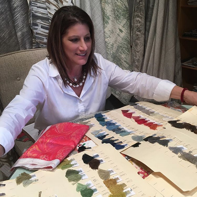
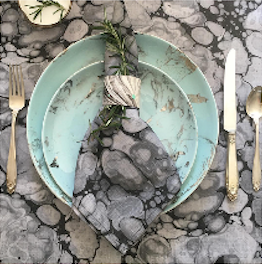
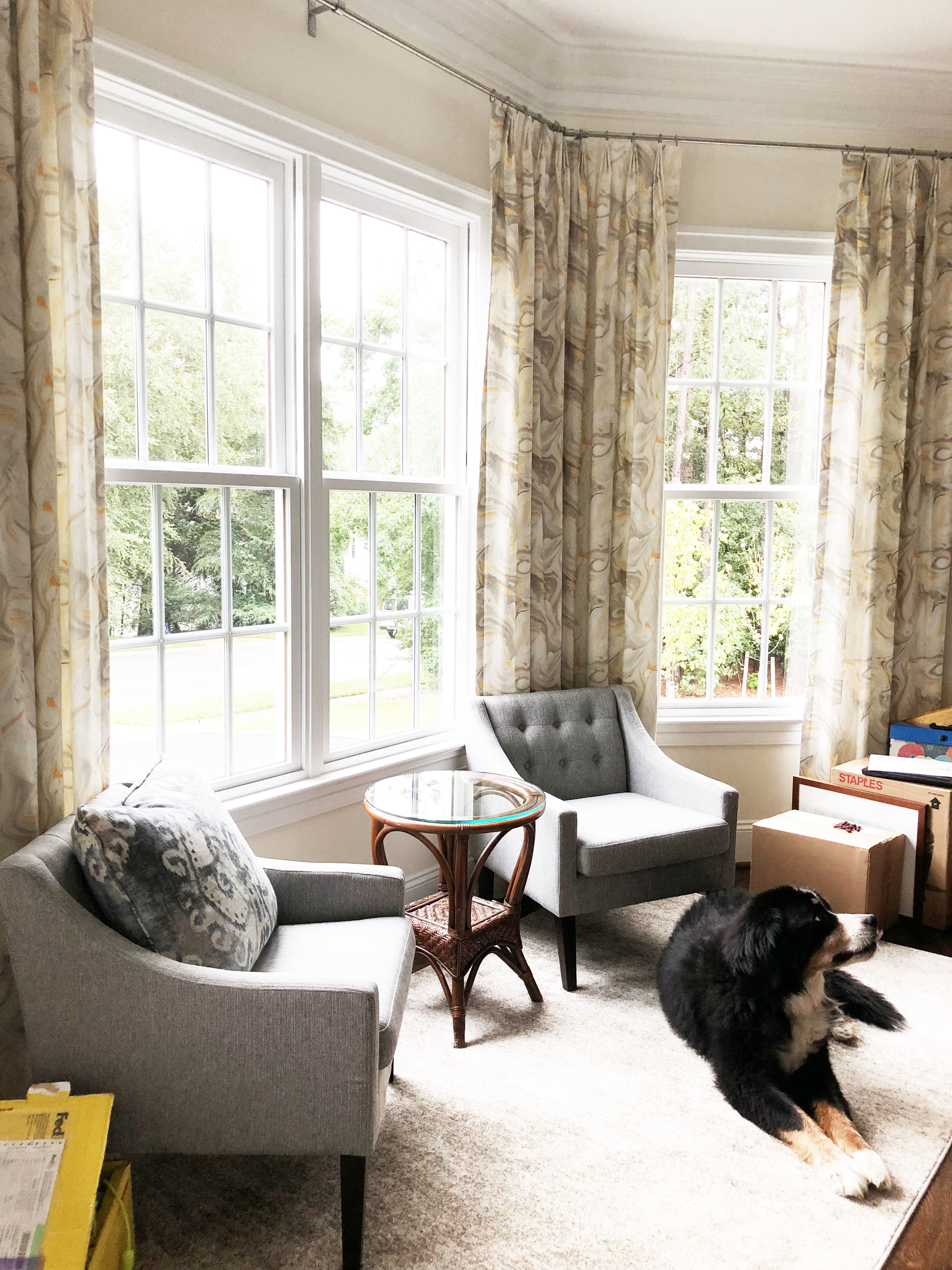
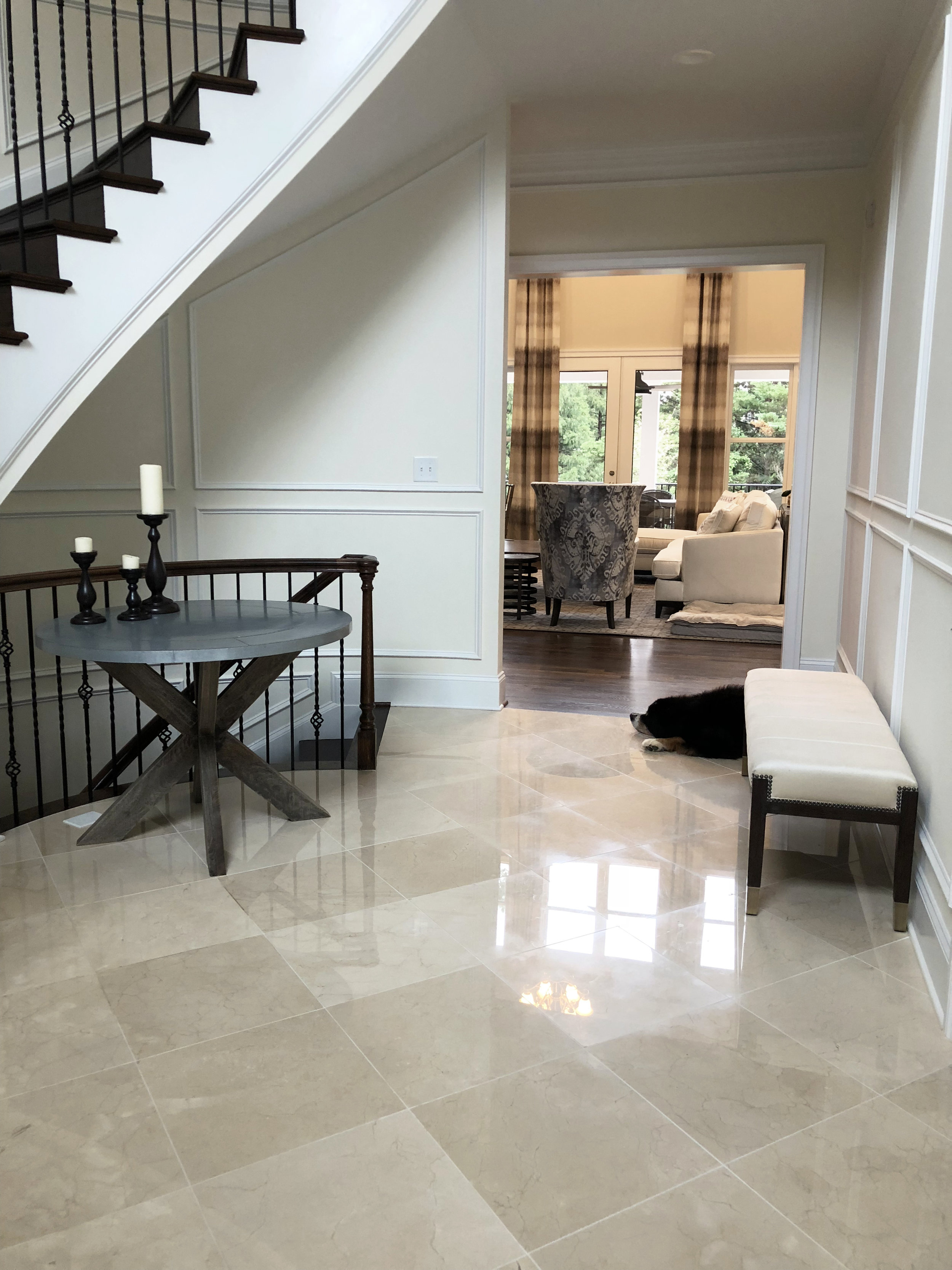
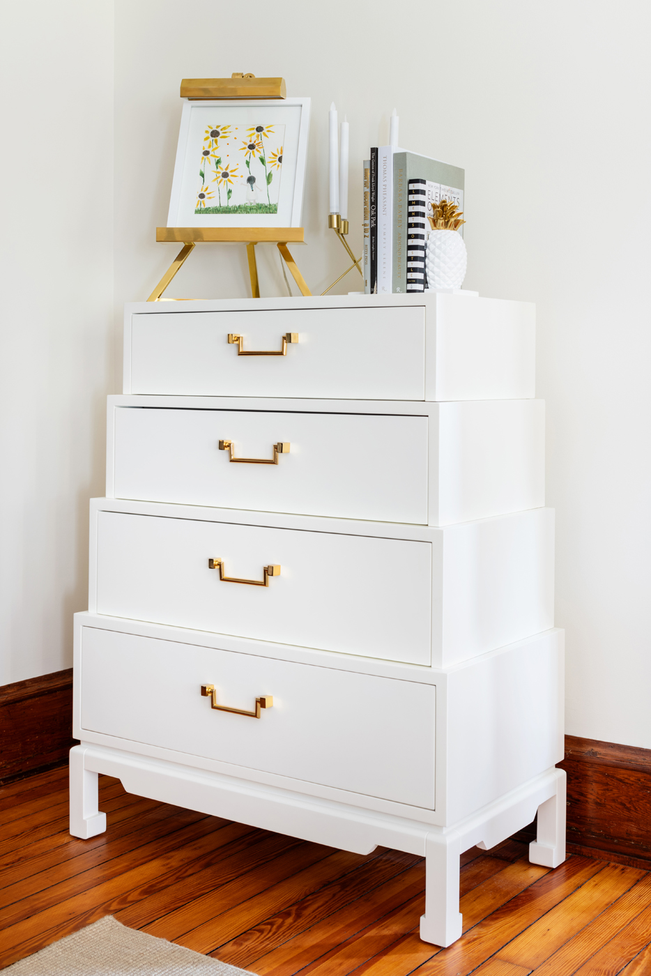
Melissa Mathe Interior Design | Photography: Ansel Olson
The new year is a time for reflection of past growth and a time to look towards all that lies ahead. As you sit back and develop your New Year’s resolutions, your new fitness routines and organizational goals, also think about your whole self-wellness in how your surroundings aid in your 2020 goals. This is a great time to give your home or office a freshening up, too. I truly believe that how you feel in your home when you wake up each day will set the benchmark for how you bring out the best you every single day. And lucky for us we have some color theorists who study all things economical, environmental, and political. Their research gives us a color palette that will have you feeling refreshed and invigorated every day and ready to take on your most ambitious resolutions.
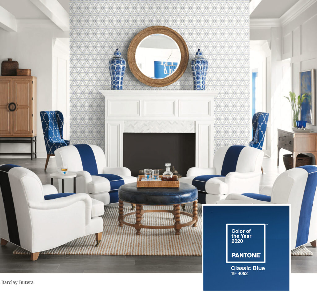
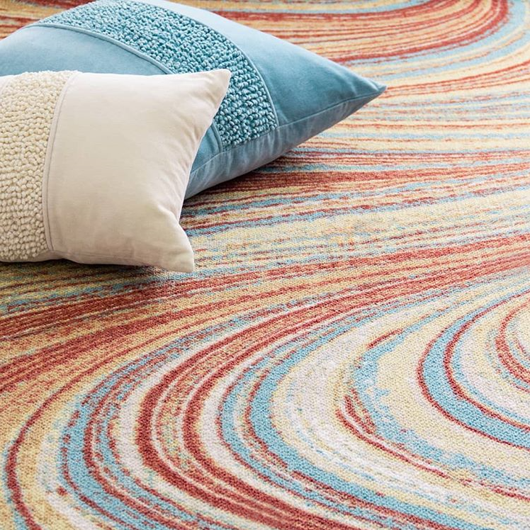
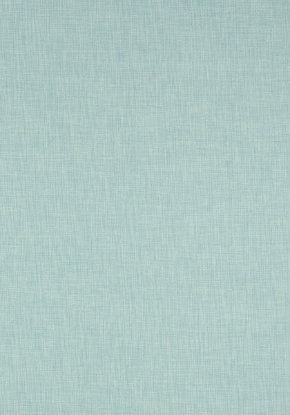
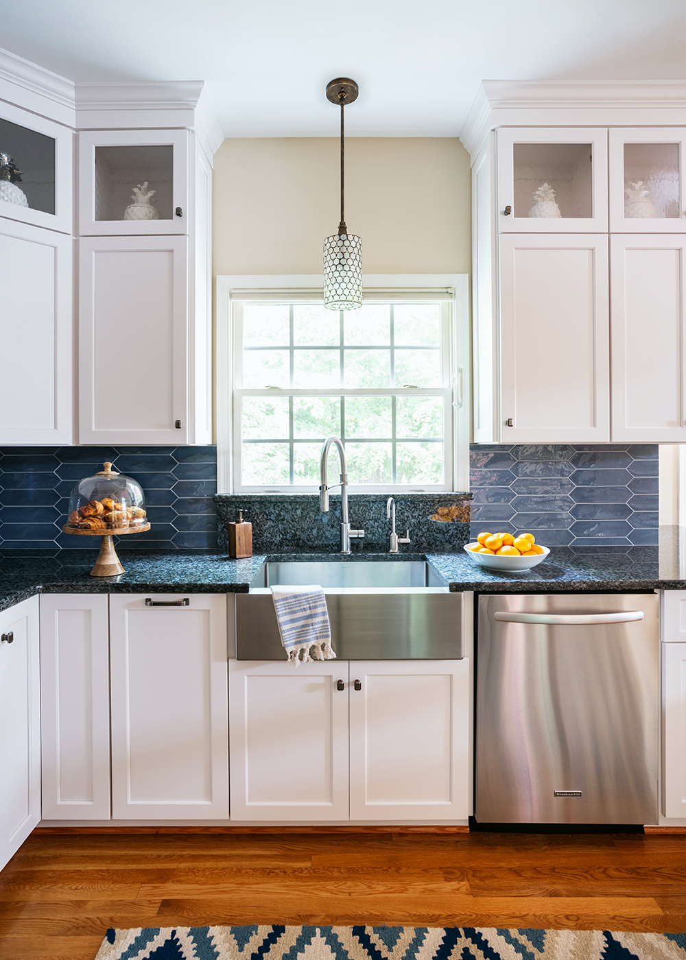
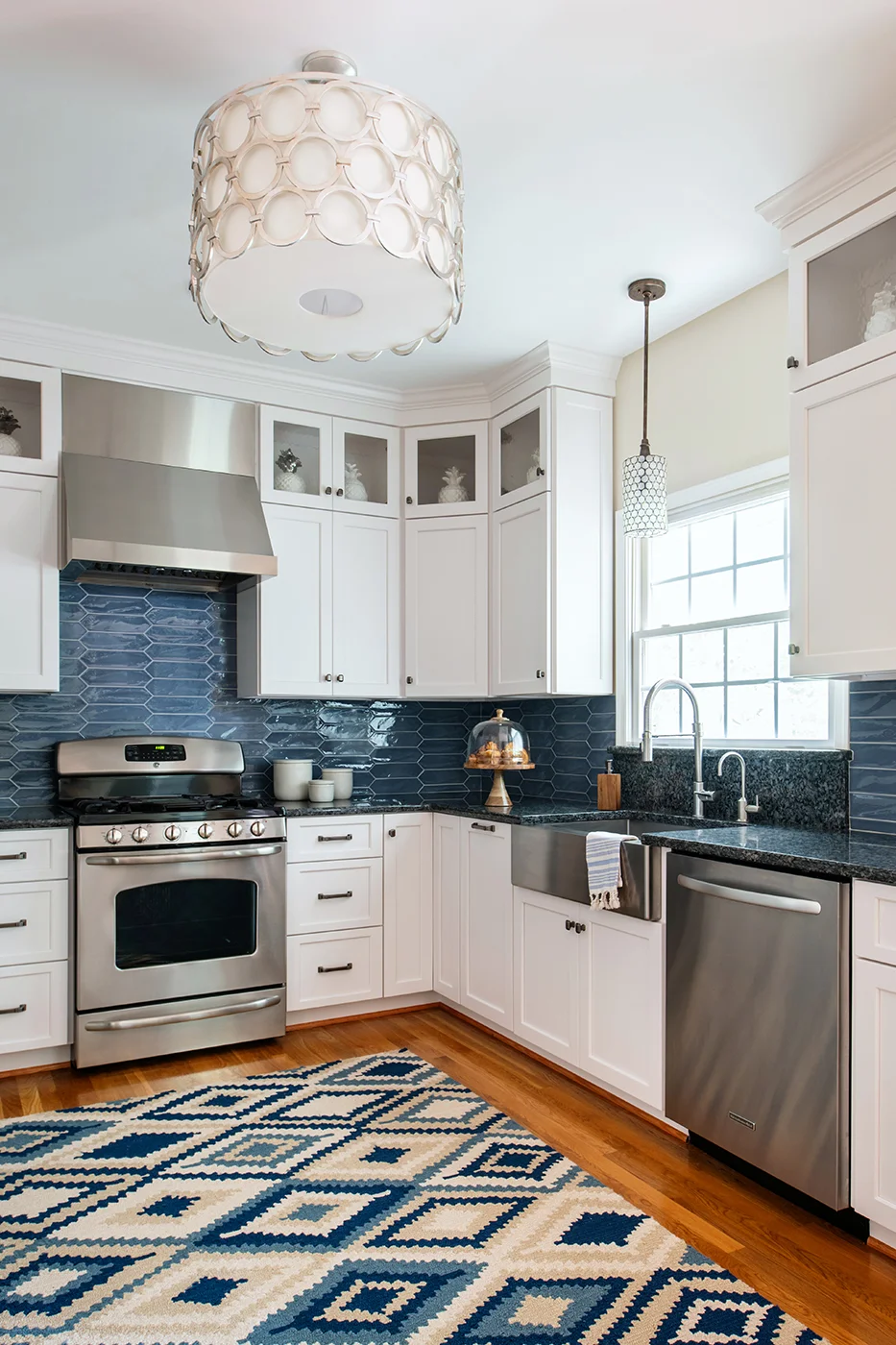
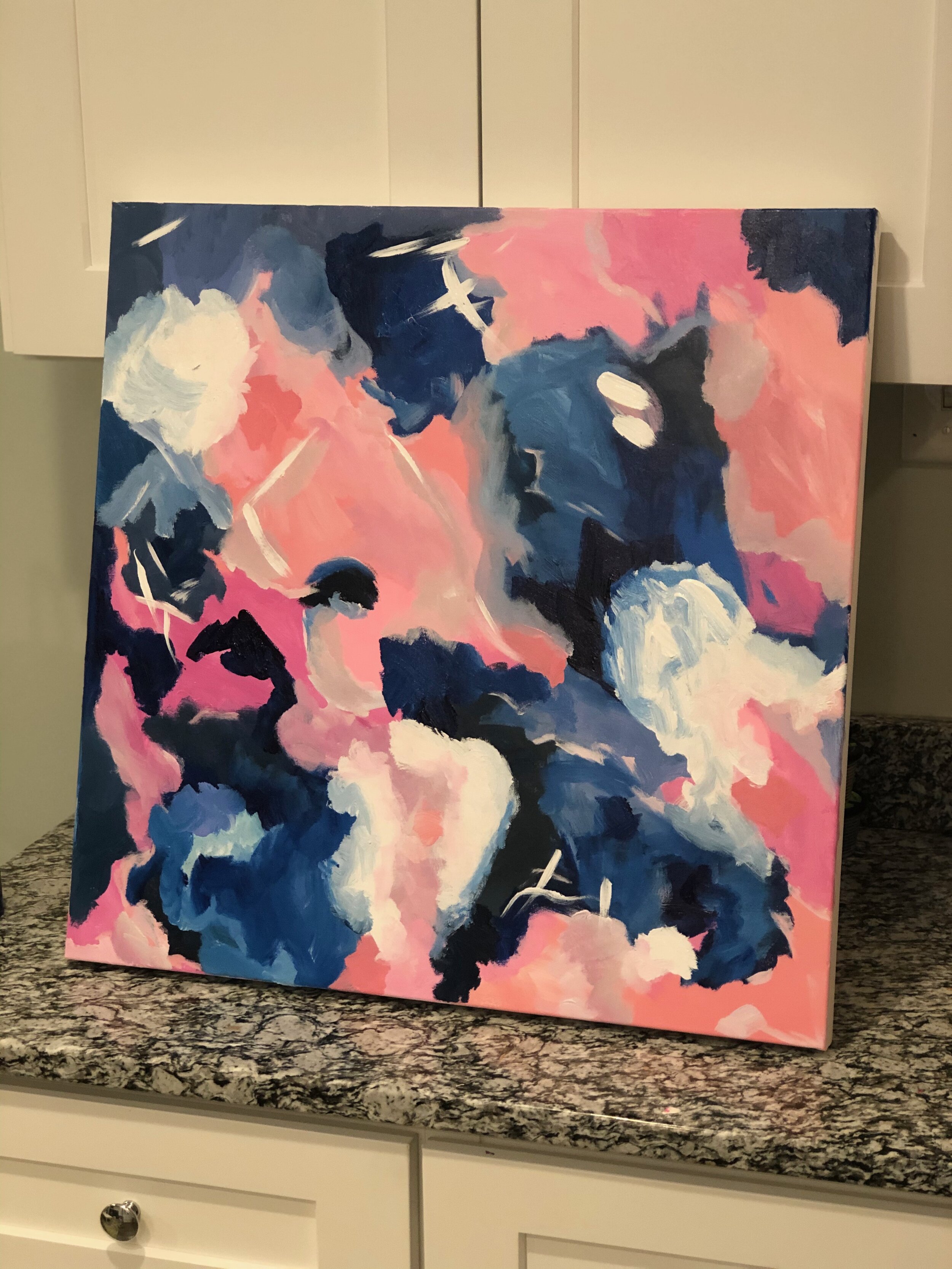
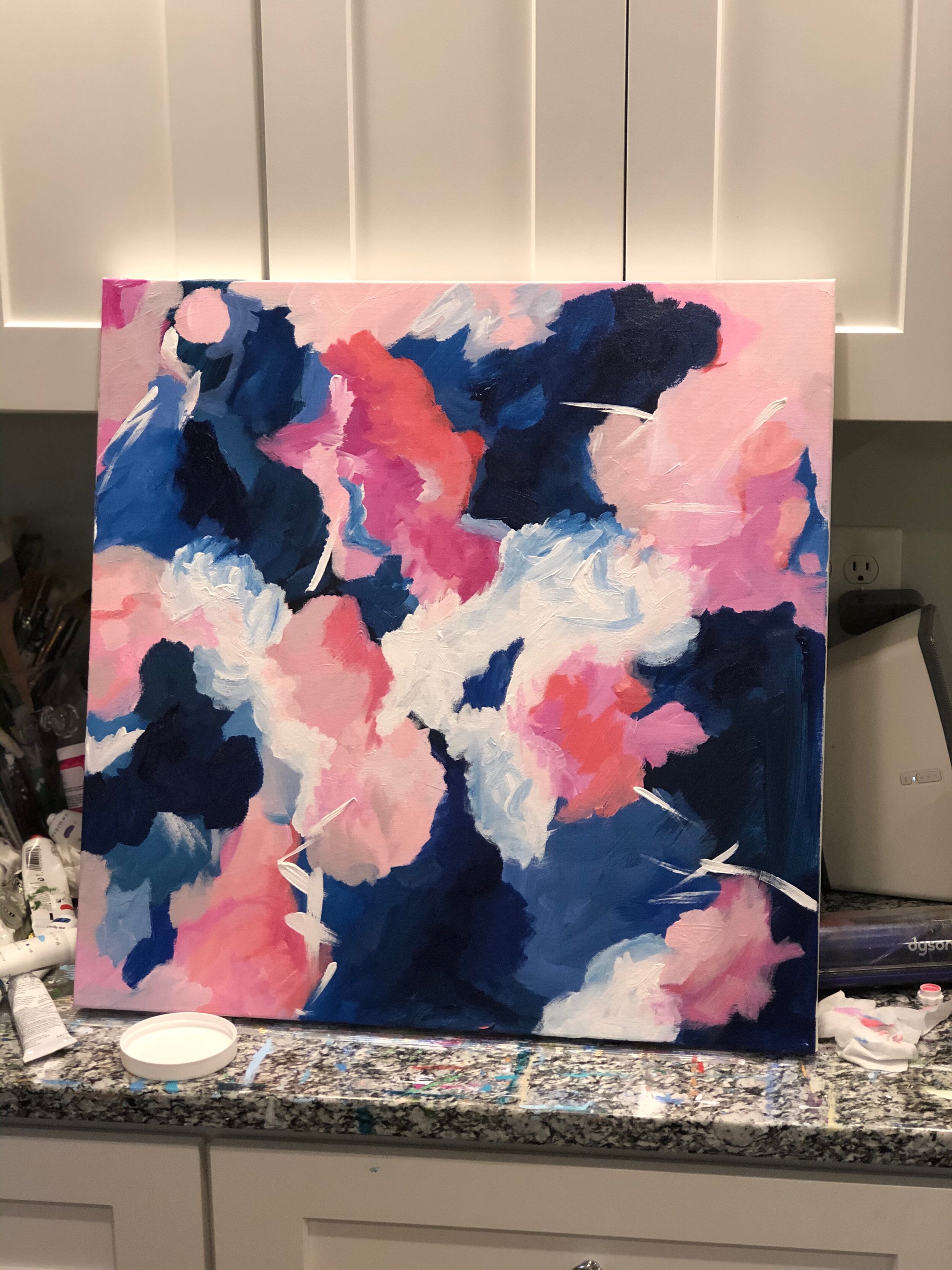
As the esteemed American Interior designer Barclay Butera says, “Blue and white is not just a color combination, it’s a lifestyle.” In other words, “Blue and White is Always Right” and we couldn’t agree more. Thought of as the color theorists in the market, PANTONE has given us the first color of the year: Classic Blue 19-4052. “Instilling calm, confidence, and connection, this enduring blue hue highlights our desire for a dependable and stable foundation on which to build as we cross the threshold into a new era.” Reflective of the sky at dusk, or the James River, this indigo blue is color with a regal history dating back to Ancient Egypt. Classic Blue is reminiscent of the deep blue sea, a place of trust and faith in what lies ahead. As you may have noticed in Melissa Mathe Interiors, classic blue is one of our favorite vibrant statement colors to weave into home interior designs.
New Year’s Resolution hack - if lessening stress is a goal, Classic Blue can help.

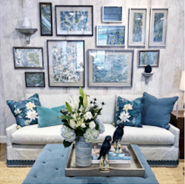
“The use of color in interior design is changing. It’s not just about what a space looks like anymore, but how it makes you feel,” said Sue Wadden, director of color marketing at Sherwin-Williams. “People want to feel grounded and inspired to pursue their mental, physical and emotional well-being. Naval is reminiscent of the night sky, which people have looked to for centuries for guidance, as a muse and as a reminder to live more mindfully.”
Similar to Classic Blue, Sherwin Williams has chosen Navel [SW6244] as the Color of the Year. This bold hue of blue embodies a sense of empowerment. This striking rich color represents very well in both a classic and contemporary design.
New Year’s Resolution hack - if being more confident is a goal, Naval will help show you the way.
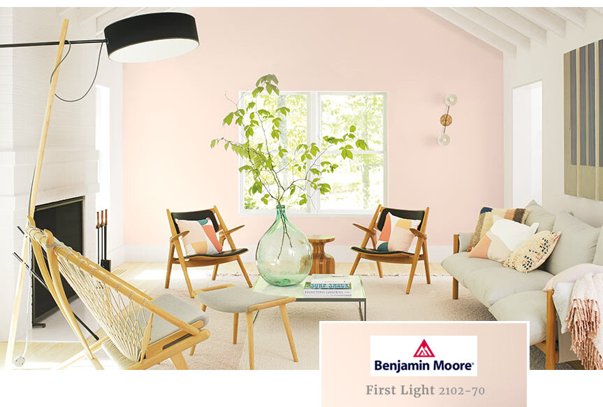
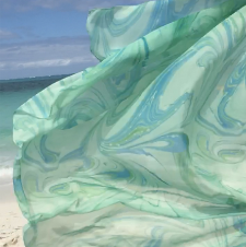
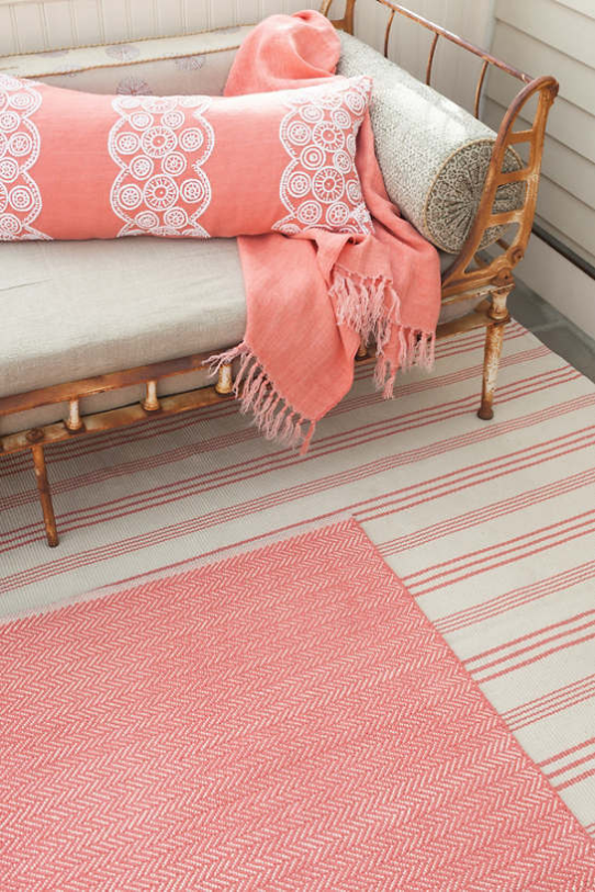
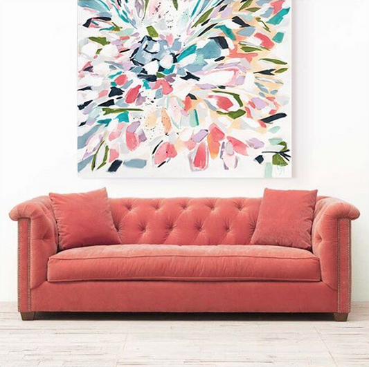
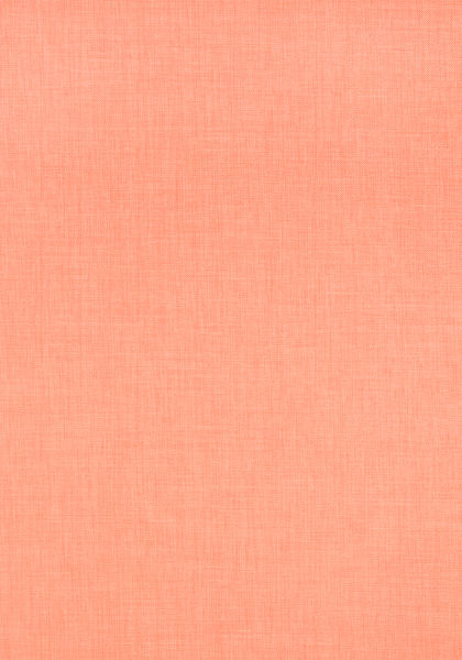
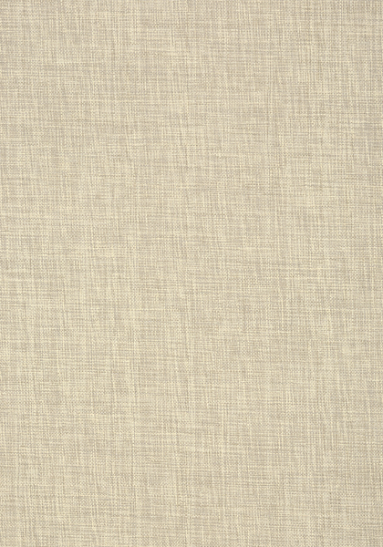
While Classic Blue and Naval come from the darker sensibilities of the sky, Benjamin Moore offers their color of the year: First Light [2102-70], thought to be the sky at dawn. “A soft rosy hue blooming with potential.” First Light 2102-70, is an uplifting soft airy pink that is a flattering refreshing alternative to white and beige. This color pairs well in complementing a vast array of color palettes in any design scheme, evoking a sense of playfulness to enliven a home.
New Year’s Resolution hack - if a renewed, better you is a goal, First Light can help you shine.

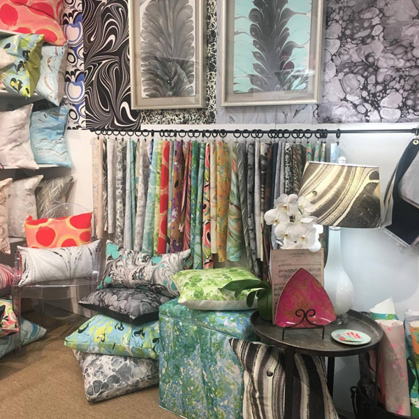
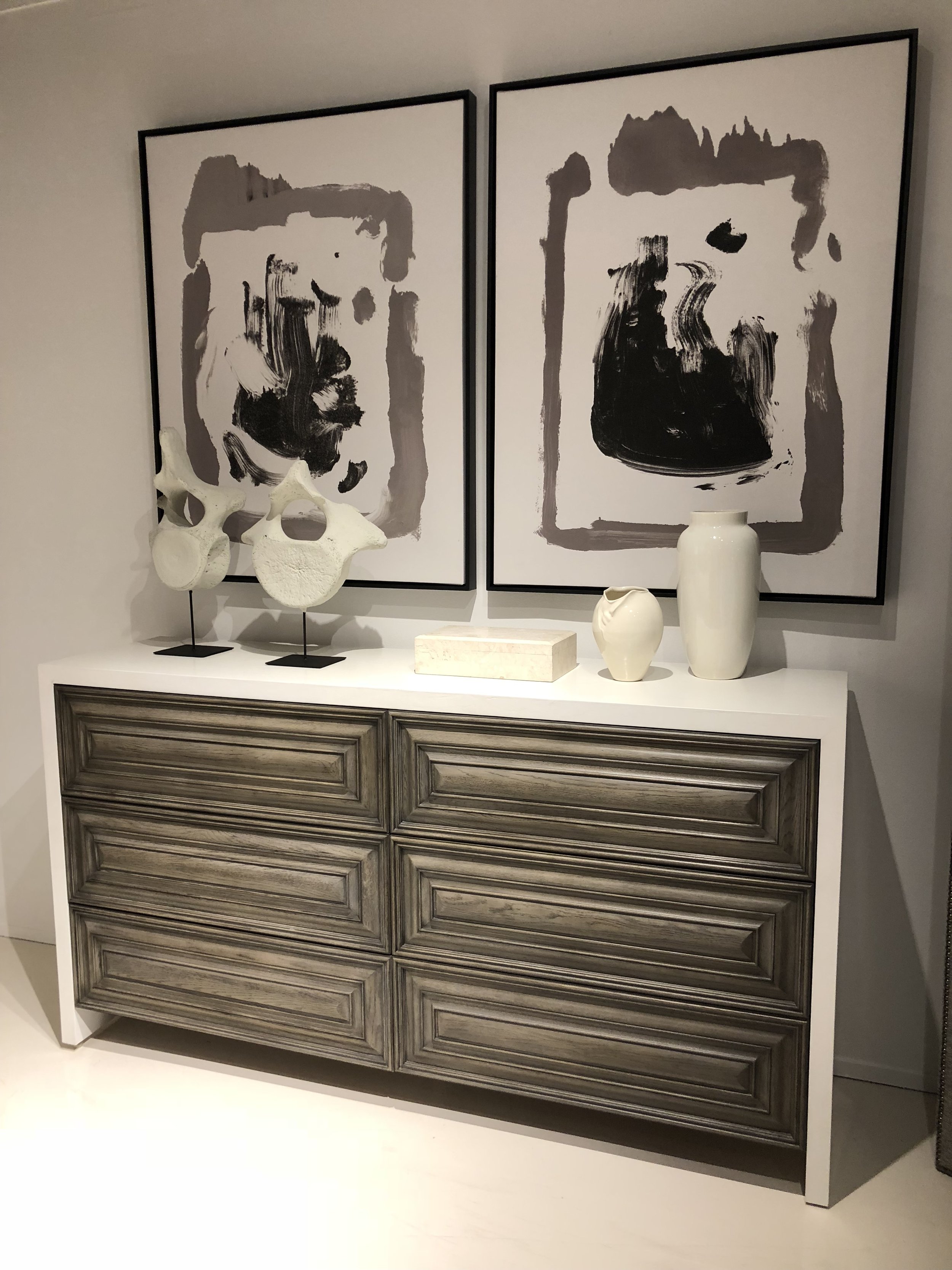
Melissa Mathe Interior Design | Photography: Ansel Olson
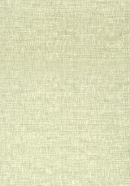
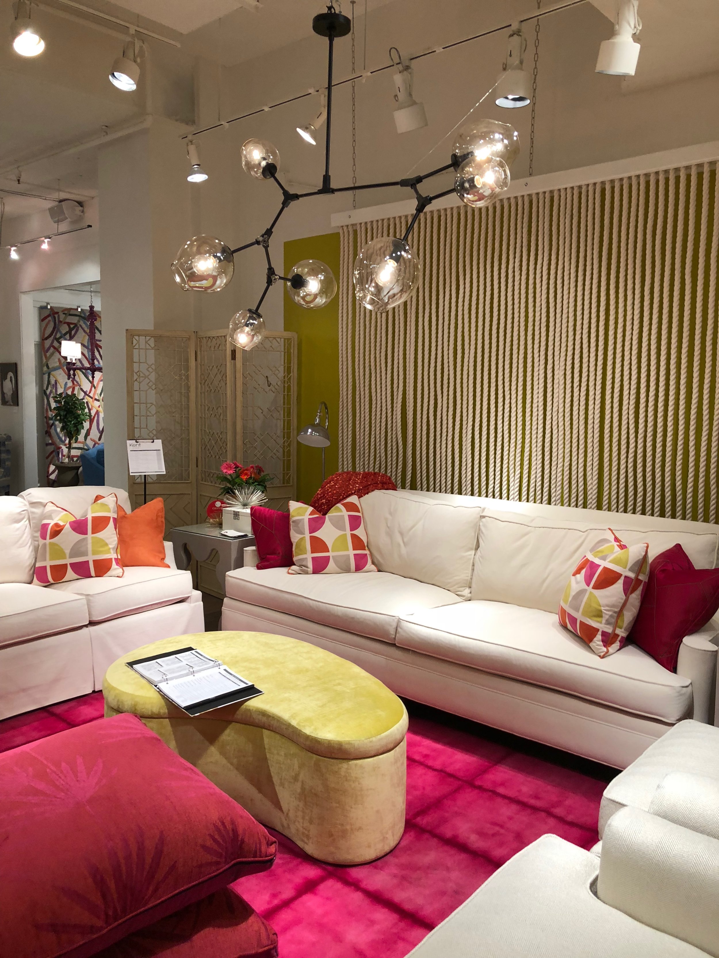
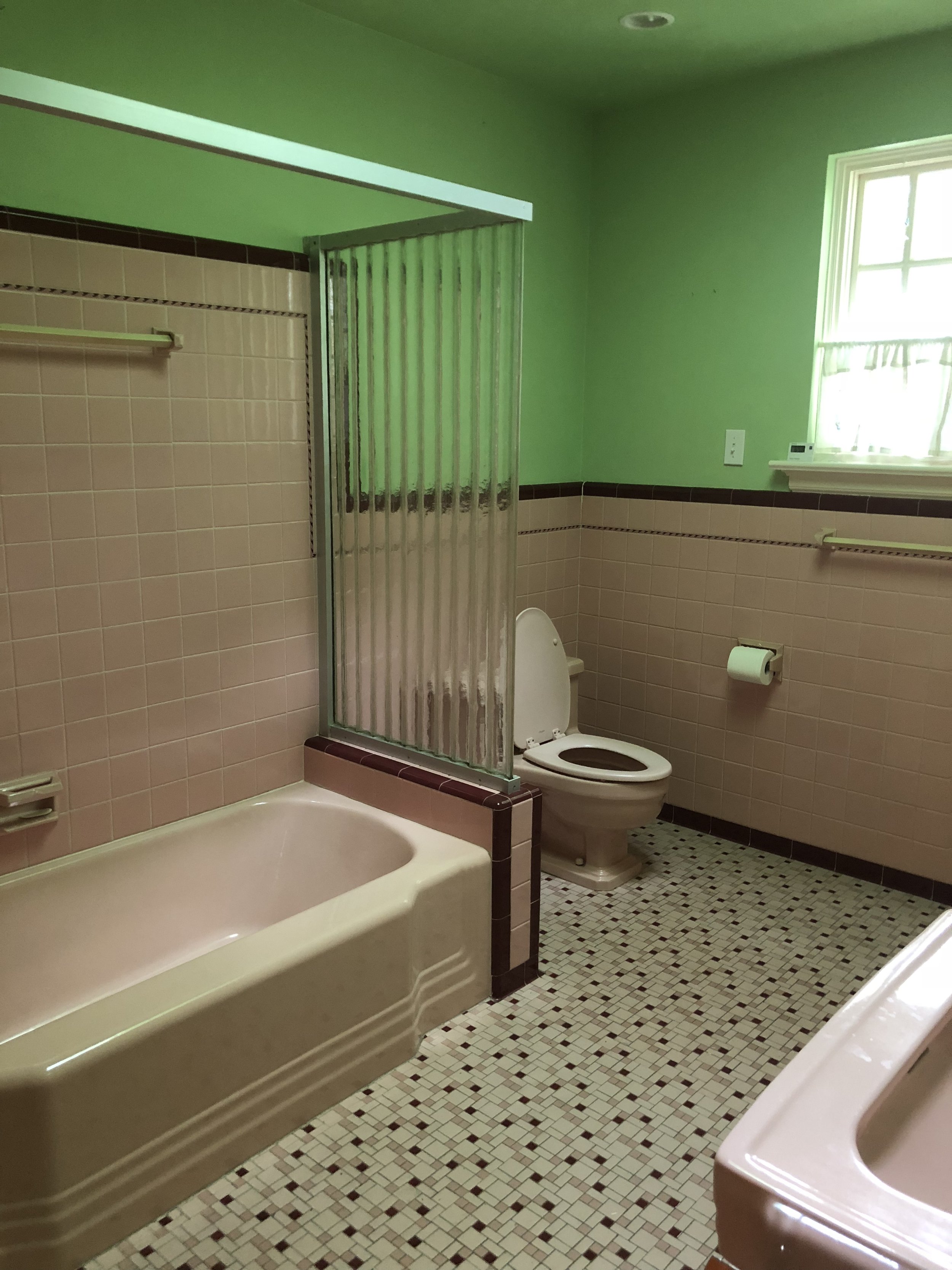
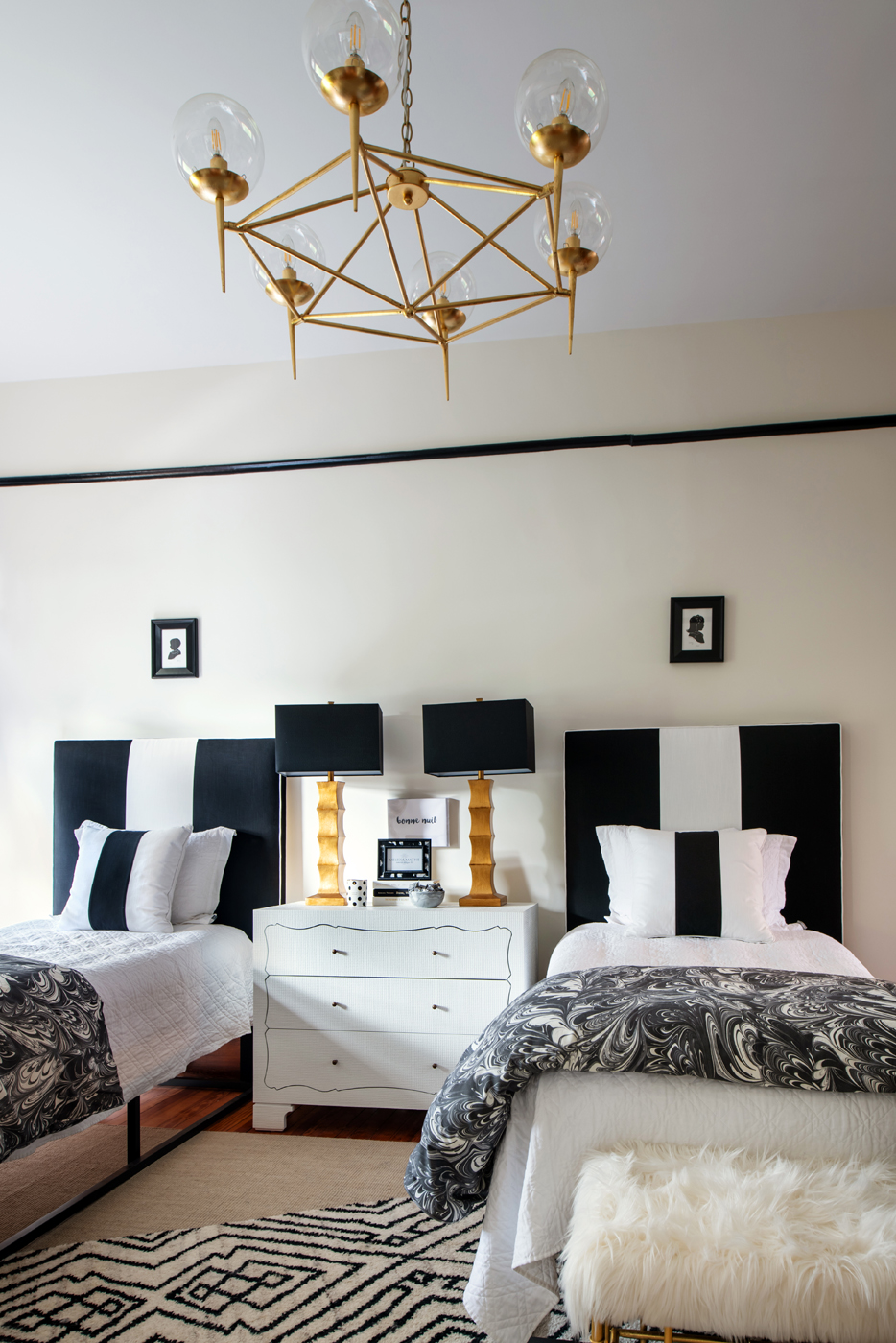
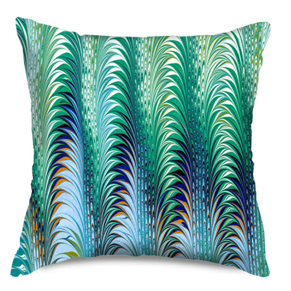
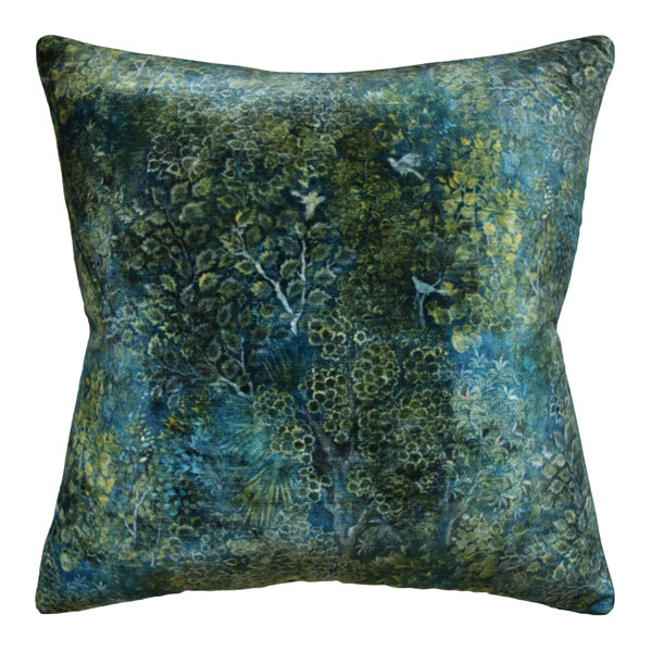
To jump in on the fun, Mathe Design is announcing our Color of the Year 2020: Pine Green. A fresh take on green that offers a deep saturation combined with a bright hue. A delightful color that we find on trend for the new year. Adding a traditionally classic color to contemporary interiors takes a room to a new level with freshness and strong color intensity as the star of the show, it rounds out the color palette of blues and pinks.
New Year’s Resolution hack - if being more grounded is a goal, Pine Green can help provide that balance.
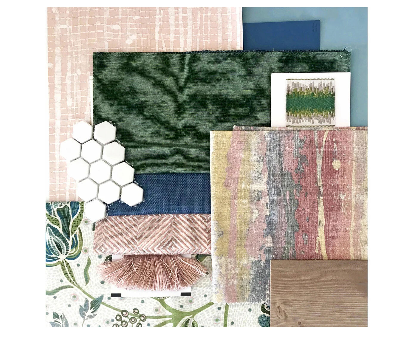
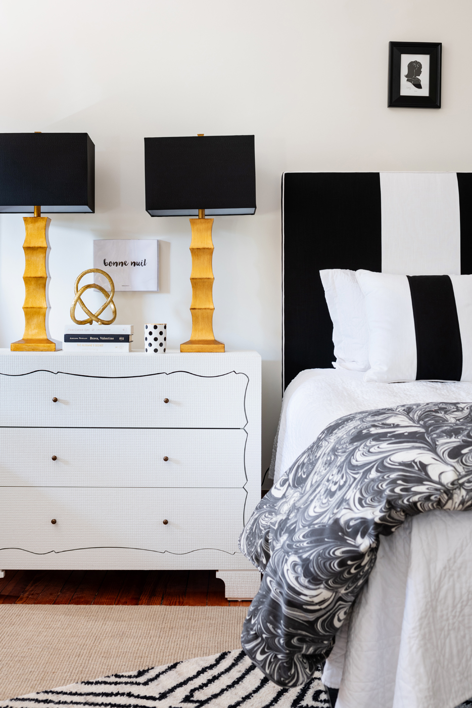
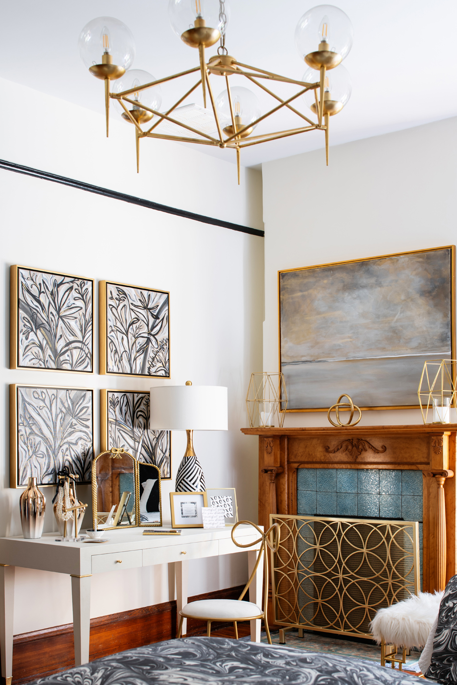
This year when I look at these four colors, my Interior Design heart skipped a beat. Not only are they wonderful colors on their own, but also they speak to each other creating a harmonious color palette.
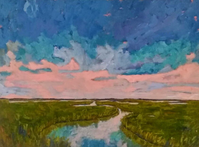
I know what you are thinking – how can I add this to my existing space? We have some artistic talent in our community that can help us pull this palette together. All it takes is a bit of goal-setting.
Contact Melissa Mathe Interior Design to purchase items shown here.

Paint Color / Table Lamps / Scalloped Iron Tray / Console Table / Area Rug
We hope you are as excited as we are to find new ways to use these trending Colors of the Year 2020.
Happy New Year!
Melissa Mathe
Contact us for all your Interior Design and Decorating needs @mathedesign.com