Wake Up Refreshed: Bedroom Design

Wake Up Refreshed: Bedroom Design

“ All you need is love… and a good design.” ~ Melissa Mathe
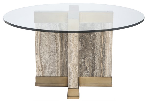
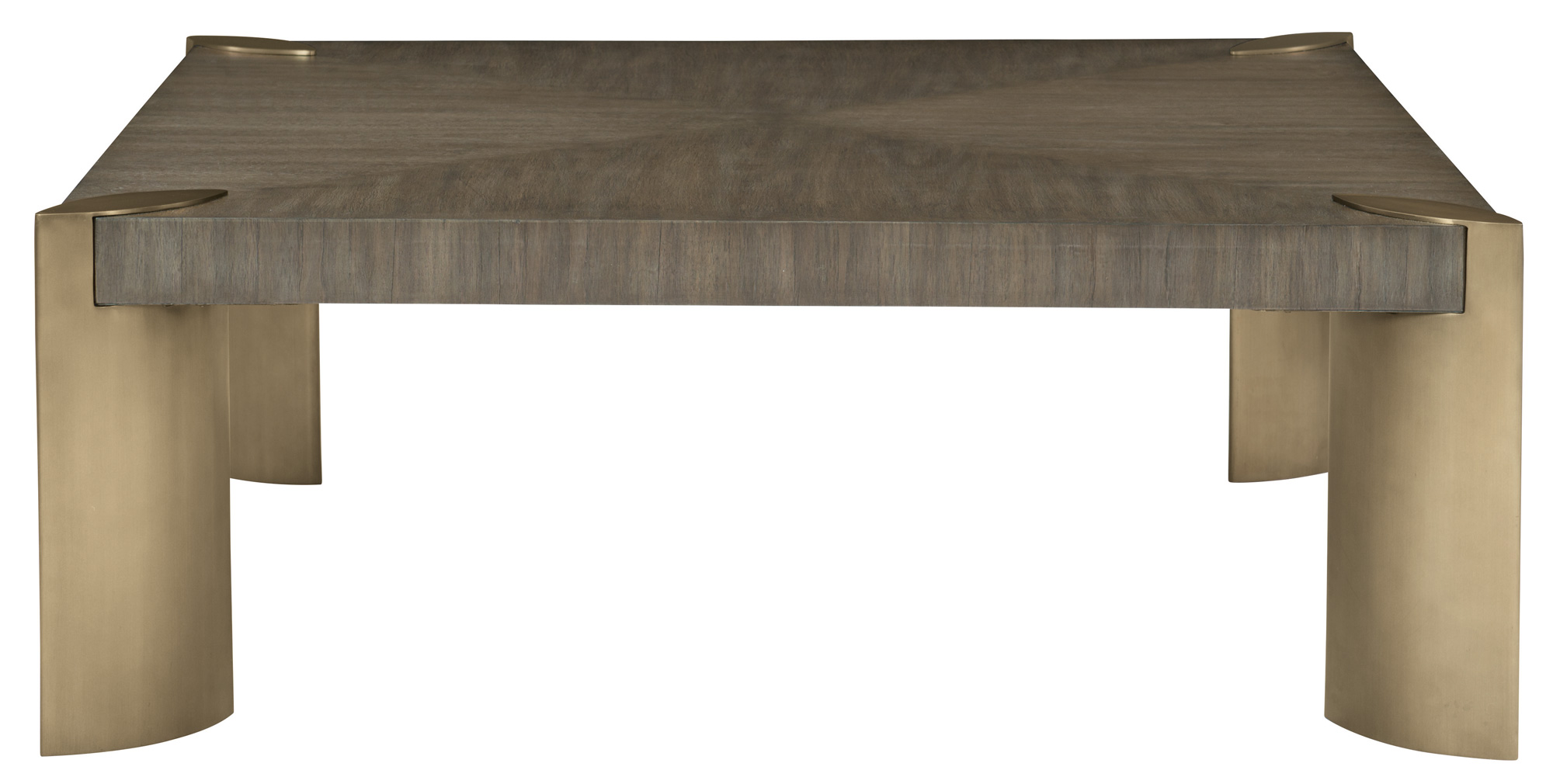
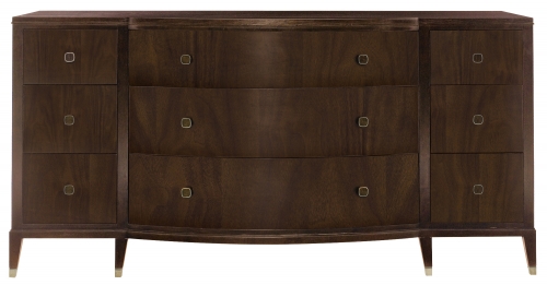
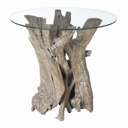
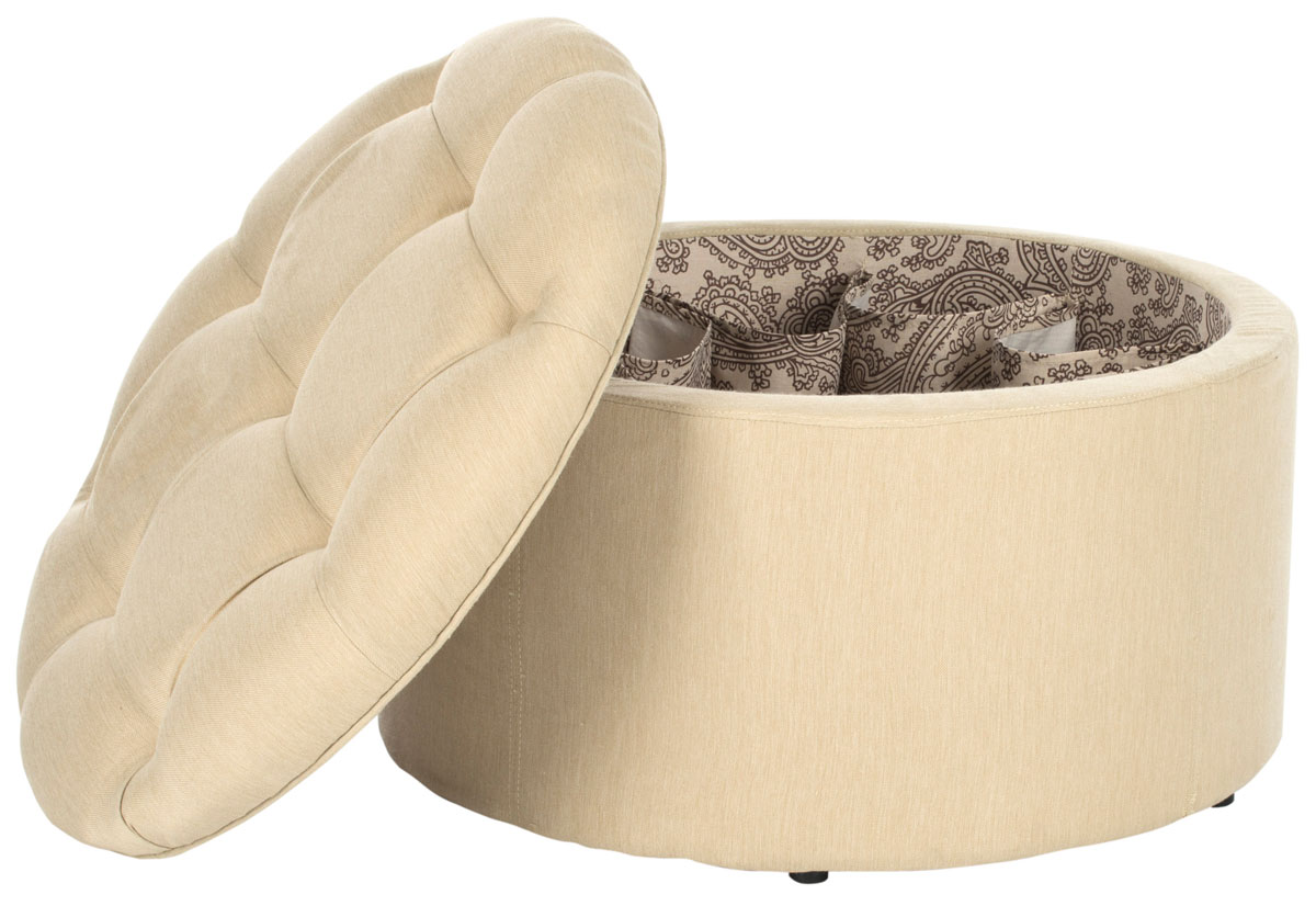
Bernhardt Furniture

Bernhardt Furniture

A well designed bedroom will allow you to get your best sleep… waking up refreshed and ready to take on the day. As a beloved sanctuary it deserves a fair share of attention to details to create a serene space. Thoughtful planning will provide not only a beautiful result but one that functions especially for you. In working with a designer it is helpful to talk about how you utilize your space. We’re sharing a few bedroom designs in this blog post to show how a design is pulled together for a client

Bernhardt Furniture

Bernhardt Furniture

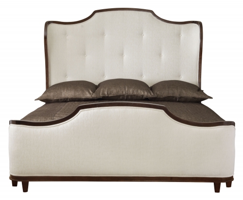
In the first spacious master bedroom design Bernhardt furniture was selected for it’s timeless silhouette and impeccable crafted quality. The upholstered panel bed draws your eye in with it’s bold curved lines. Combining with it a more traditional dresser and a contemporary nightstand gives the master a feeling of grand updated sophistication. While selecting paint the tray ceiling was chosen in a complimentary paint color to the walls so to accent the architectural details. Custom draperies made with additional trim detailing were fabricated for those added designer touches our clients love.

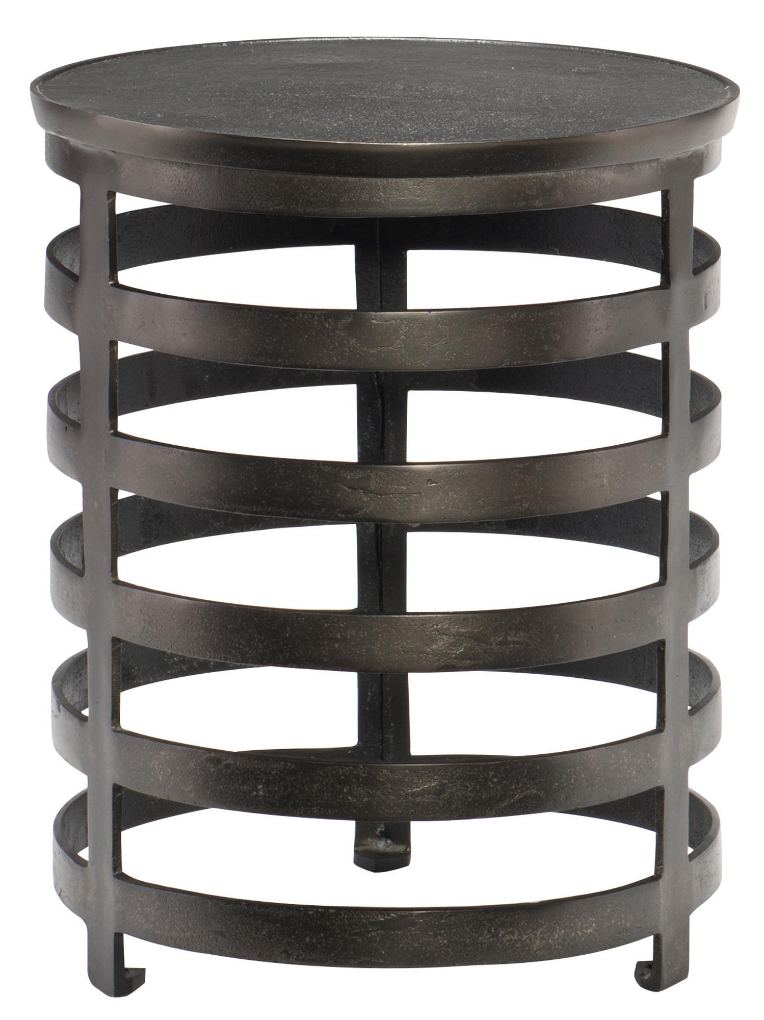
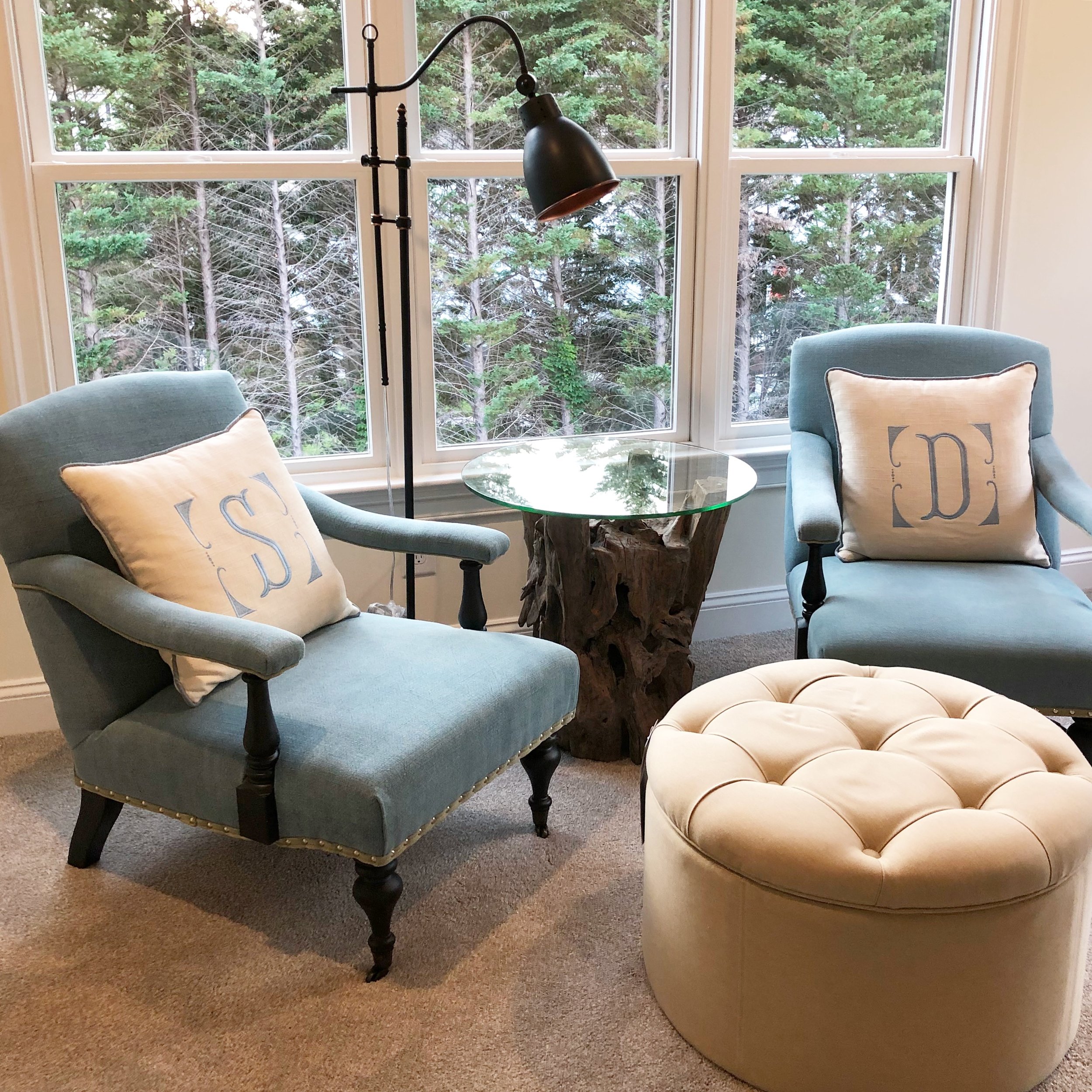
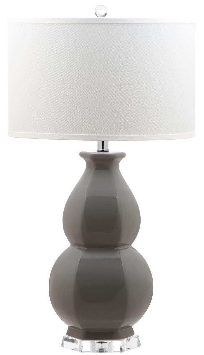
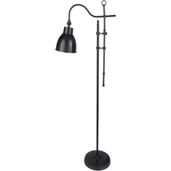
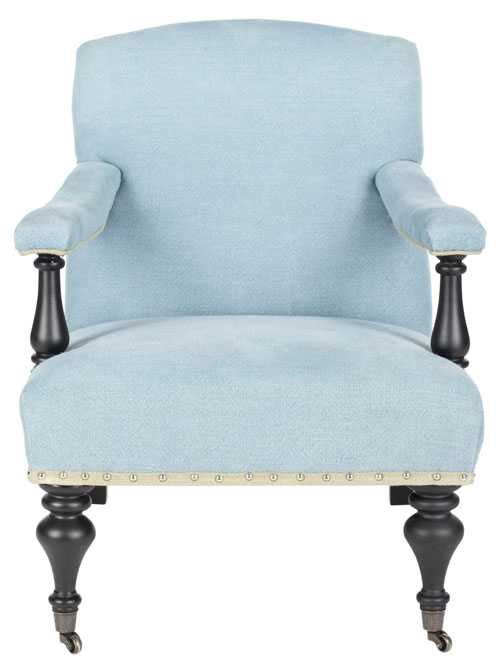
A quiet sitting space was created as a separate area where the couple can retreat to unwind reading or talk about the day. Unique furniture pieces and lighting fill this area and reflect our clients personal style. Personalized touches such as monogrammed pillows give attention to special details that make a room feel more intimate.

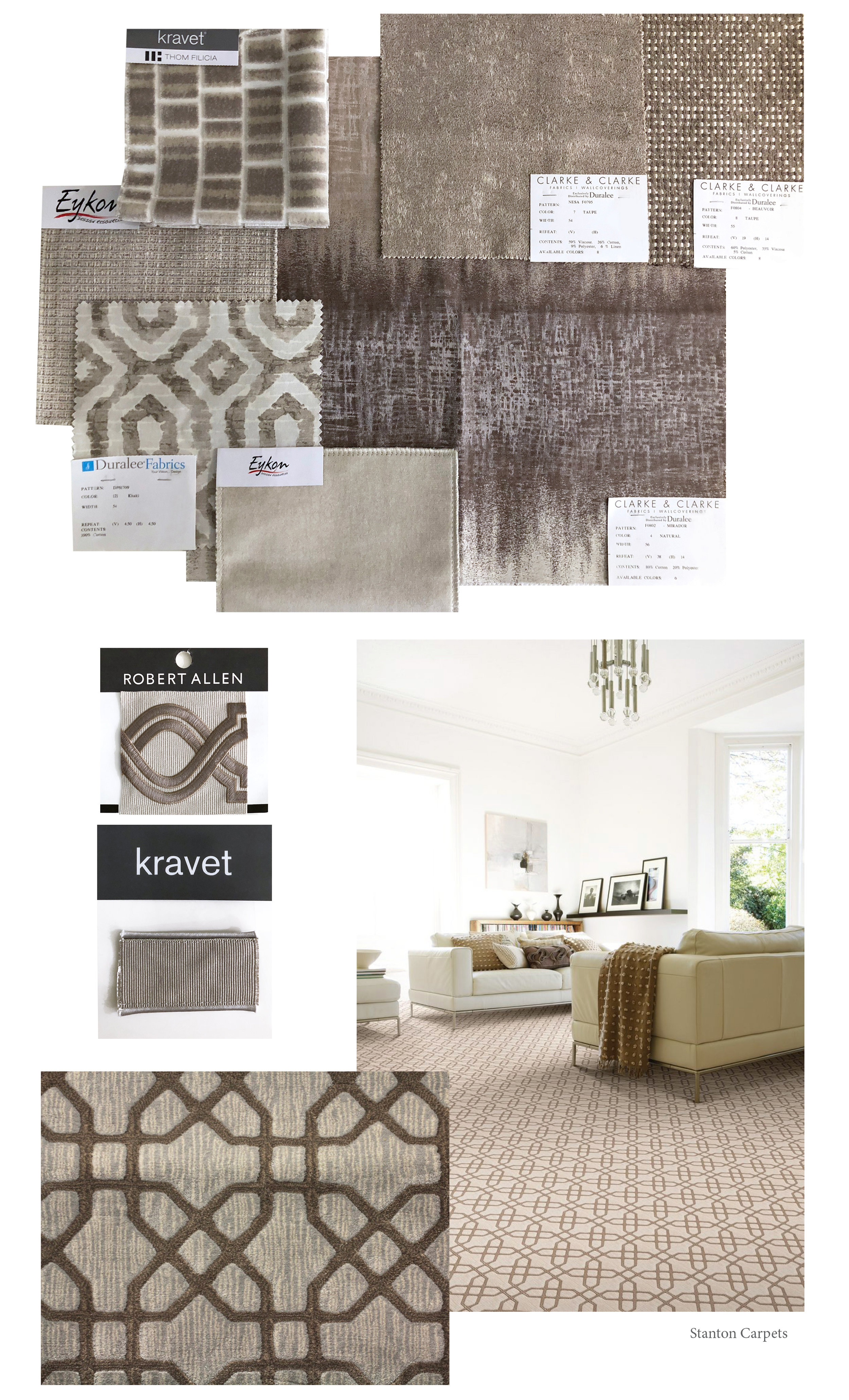
We’ve included resources to share for the sourced furniture and fixtures selected on this residential project.

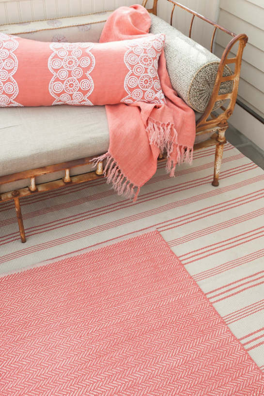
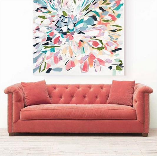
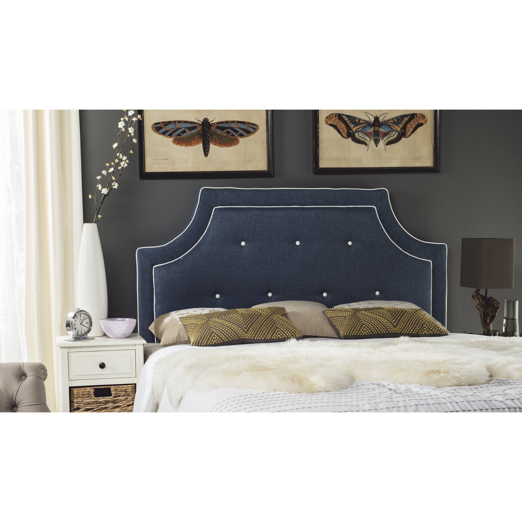
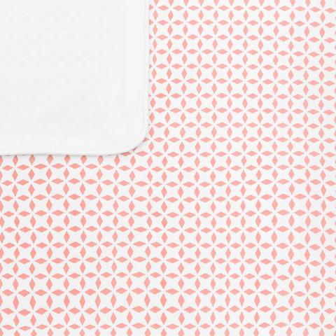
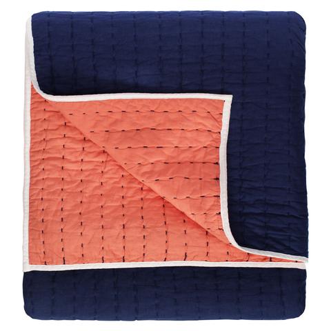
A second bedroom design is pulled together with an adapted theme to it in a subtle way. This particular residential project is located in a warm climate where the sky and sunset were drawn from as inspiration. The cool blue tones paired with warmer coral toned colors create the sense of sunny skies and soaring temperatures all around.
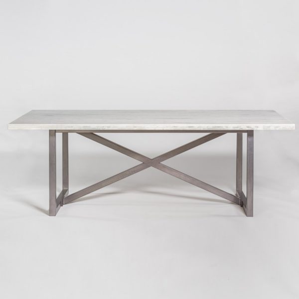
Crane & Canopy

Crane & Canopy

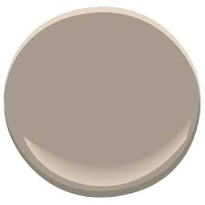
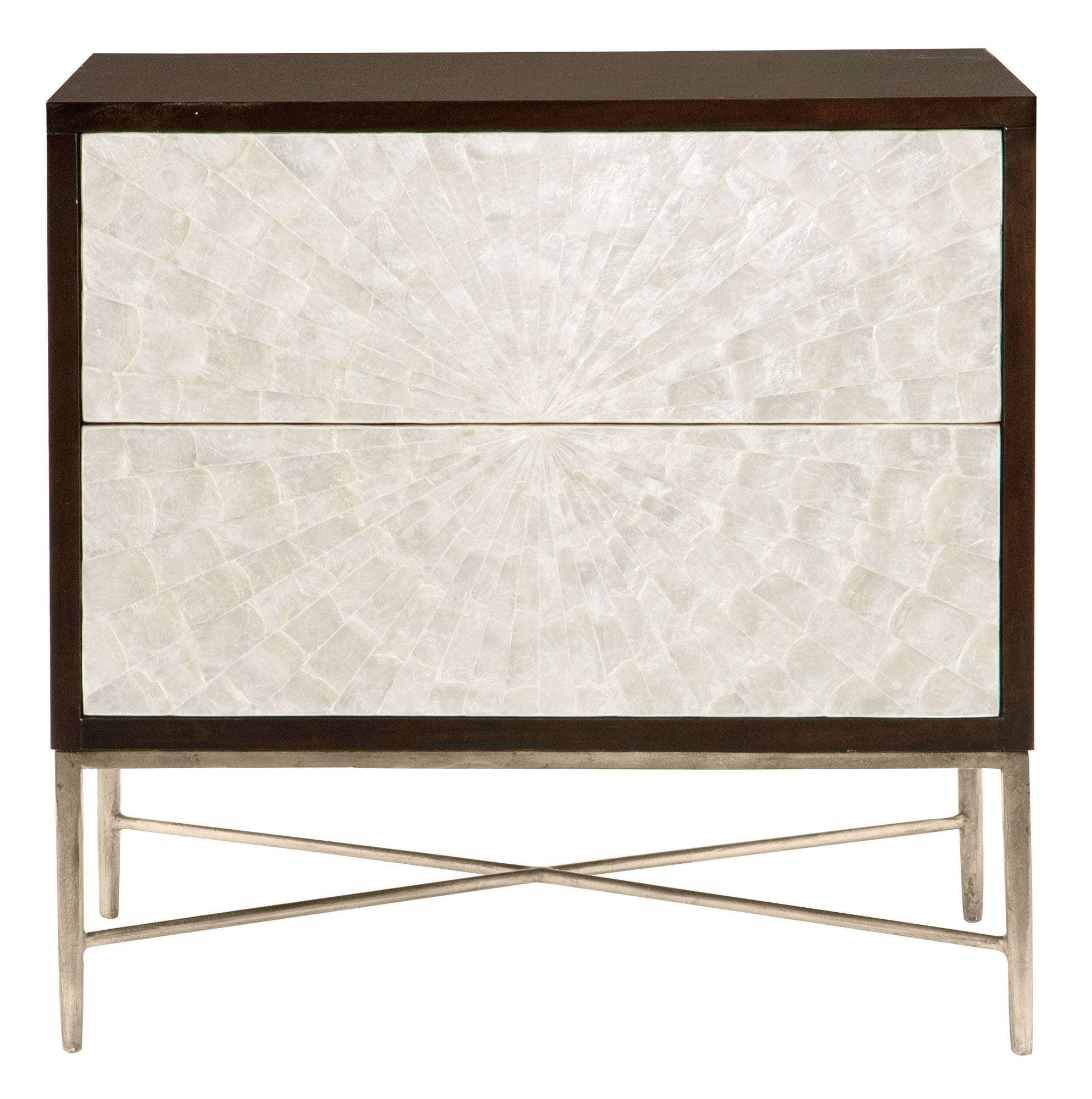
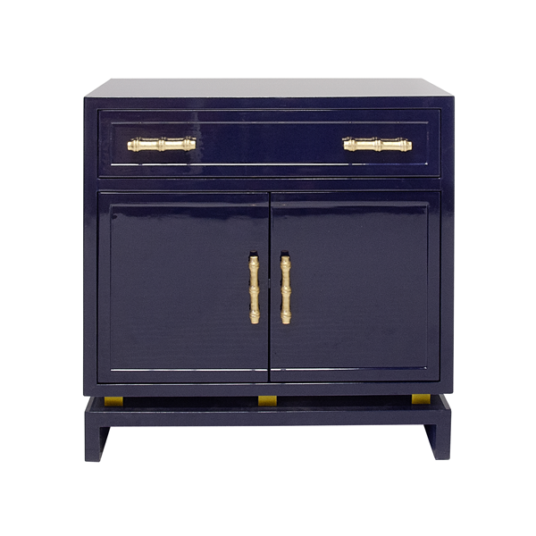
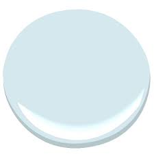
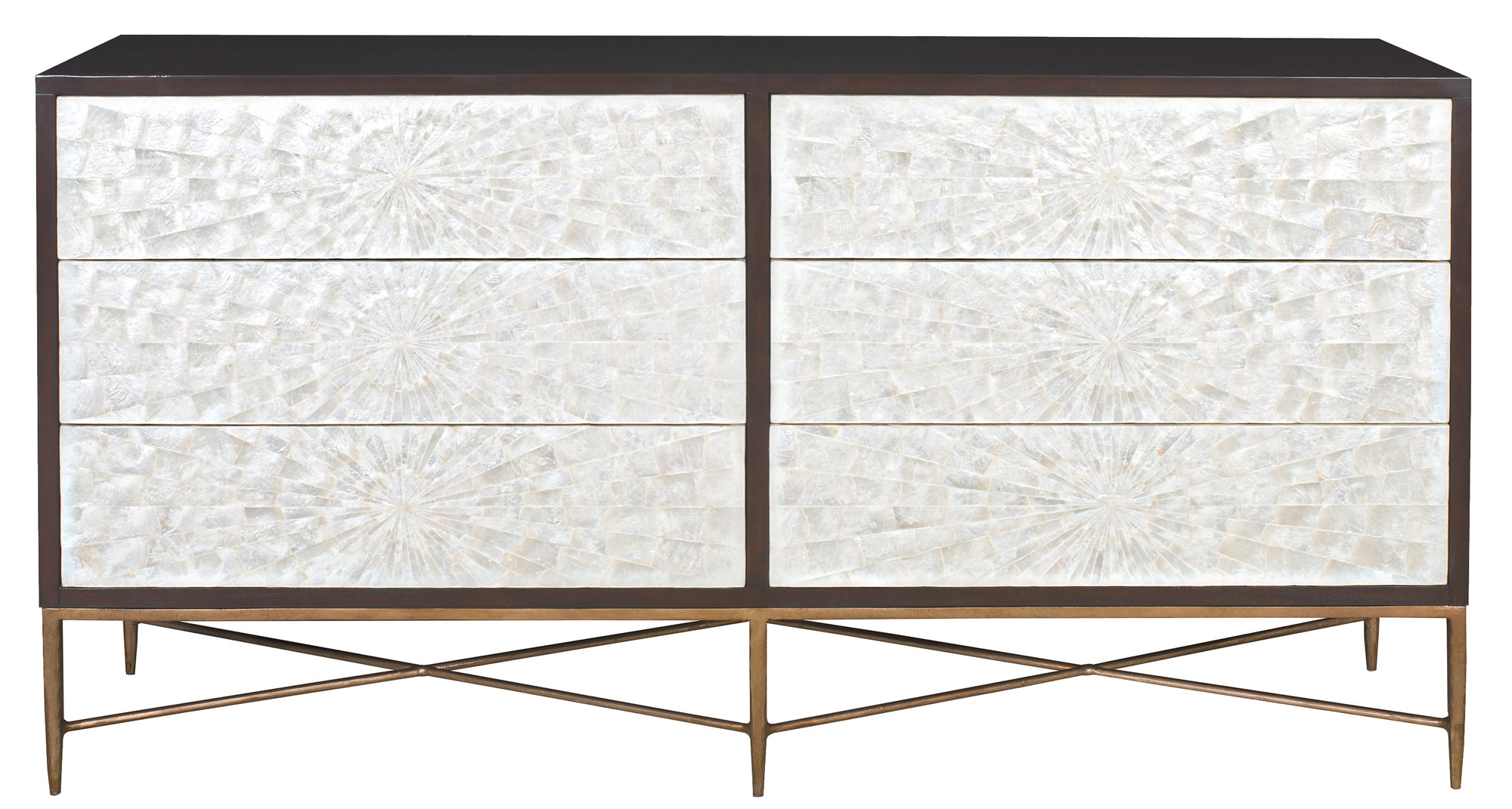
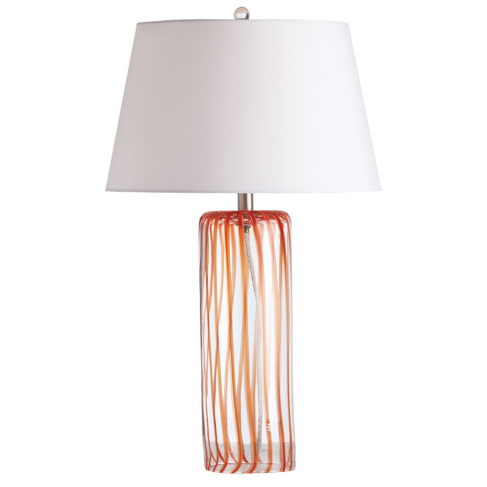
Soft blue walls painted in Benjamin Moore color Harbor Fog bring in the sky inspiration as a backdrop. The design board shows a custom covered upholstered headboard and bedding in a complimenting color palette. For additional interest the dresser selected has capiz shell covered drawer fronts to lend a nod to shell fish from the ocean. Flanking the headboard are two high gloss lacquered navy blue night stands with brass bamboo pulls for that added designer sophistication.

More resources to share with you here for sourced furniture and fixtures selected on this residential project.

Having a bedroom that is designed in a style all your own will help you to related to your space and feel comfortable in it from day-to-day… especially in moments of much needed unwinding.

Cheers!

Melissa Mathe

*Contact mathedesign.com for specialty pricing and all your Interior Design needs.

Color Inspiration: Living Coral Pantone Color of the Year 2019

Color Inspiration: Living Coral
Pantone® Color Of The Year 2019

“Colours are the smiles of nature.” ~ James Henry Leigh Hunt

190116_Pantone2019_IntroSection.jpg

With each new year comes the anticipated announcement of Pantones new color of the year. Much like waiting to open new presents during the holidays… in early December the color trend forecast is made. To our excitement the 2019 Color of the Year is Living Coral 16-1546. As a global influencer in color systems Pantone sets color trend standards in multiple industries for fashion, home furnishings, industrial design, as well as product, packaging and graphic design.

190116_Pantone2019_Collage.jpg

A vivid color inspiration choice that mesmerizes the eye and mind with an optimistic fresh and cheerful presence. Durived from marine and sea life as well as present in our daily digital imagery. This warm, peachy color with golden undertones nurtures and supports other colors in it’s midst and fulfills the desire for playful expression. It also happens to be one of our favorite colors… so adding this “it” color into our clients interior projects is a welcomed second nature.

Here are a few sources that we love who embody this color in their product lines. A visionary designer – Annie Selke has offered quality Dash & Albert rugs and luxurious Pine Cone Hill sheets and bedding for over 25 years. Providing happy colorways to fill your home with joy, the herringbone and striped area rugs and throw blanket are the right pop of this color. The ‘Farm Girl’ painting done by the well studied Taelor Fisher is full of this fresh Living Coral “Color of the Year”. A prime example of the way this color attracts your eye as well as creating harmony with other colors.

Photo Dec 05, 11 08 18 AM.jpg

In a recently designed clients living room we included this bright color in the shown color palette. You can see some of the ways we balanced the room out with fabrics, furnishings and wallcovering. As the ivory and blue in the geometric wallcovering and sofa compliment the backdrop of the sand linen color in the area rug. The coral and green colors in the chair upholstery and throw pillow fabrics add a playful vibrance giving the space liveliness and balance.

Color Palette

spacergraphic_2.png
Photo Dec 05, 11 09 44 AM.jpg

We are delighted to introduce this new color inspiration to you and hope you enjoy the examples we’ve shared. We hope you find special ways to incorporate the Pantone Color of the Year 2019 - Living Coral in your interiors and surroundings this year.

Cheers!

Melissa Mathe

*Contact mathedesign.com for all your Interior Design needs.

The Whole Nine Yards In Mink

the whole nine yards in mink

"Simplicity is the ultimate form of sophistication" ~ Leonardo da Vinci

Bernhardt Furniture Company

Bernhardt Furniture Company

As our economy continues to slowly rise, we see color trends warming up.  Grey will still be around, but you will see the use of warm grey and "greige" (the term given to a grey/beige color). Enter: Mink.

Dreamy neutral interior spaces can transport the aesthetic to an elegant and luxe state.  While subtle accent colors, pattern, and texture play a supporting role in bringing added interest.  We have our eyes on a color we affectionately call "Mink"... doesn't it just sound pretty.  Well, we're pretty excited about adding this decadent color into design schemes to create that neutral clean contemporary feel.  Mink is a rich color that is confident and warm. Using soft creamy colors to provide a serene base and layering in this deep color provides  a sense of grounding to the overall interior style.  This color can be found in all interior furnishings: fabrics, wood tones, tile, and stone.

As you can see these fabric selections, trim and carpet are lovely examples that can easily be pulled in - to compliment.  As we've recently sourced furniture and lighting for this aesthetic we have an assortment to share along with a to-die-fo…

Here are details on neutral furniture and fixtures for your resource. Plus a to-die-for paint color to tie everything together.

We hope you enjoy our new color crush discovery and also hearing more about this luxe style.  We wouldn't hold it against anyone to casually use this color for there next professional manicure either... because we've done it ourselves.

Cheers!

Melissa Mathe

*Contact mathedesign.com for specialty pricing, non-priced items and other Interior Design needs.