Behind The Logo: Pineapple
“Be a pineapple: stand tall, wear a crown, and be sweet on the inside”

In the interior design world pineapples have well been known for representing the universal symbol of welcoming, friendship and hospitality. Incorporating this symbol in the Mathe Design branding story came naturally as it’s a traditional motif element resembling a part of the design style adopted in many projects - classic contemporary.

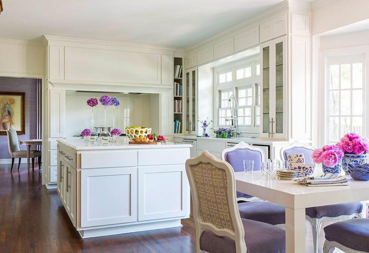
pineapples in mathe design decor
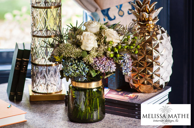
After a client project is in completion and in Mathe Design fashion… a pineapple decor element is added to leave behind a little part of an imprint of working together to create their new space. Whether a pair of bookends or a golden pineapple decor showpiece is added it’s fun to find that something special to gift them as a remembrance.
There’s a lot more to this welcoming symbol shown throughout history, often times we get questions about what the meaning of pineapples is in design. We’re sharing a bit of a history lesson to shed light on the subject.
[RSOL Designer House 2018; photograph by Ansel Olson]

pineapples in history
Originated in parts of South America the pineapple, by way of migration and commerce, made it’s way to the Caribbean Islands. As history has it, Christopher Columbus encountered this sweet fruit for the first time on a voyage to the island of Guadalupe in 1493. After bringing the fruit back to Europe, it quickly became a delicacy - rare to obtain and challenging to harvest in cooler climates. Thus turning into a symbol of opulence and luxury.
Throughout the 17th and 18th centuries the pineapple was in such high demand that it was even on the rental market to those of less fortune for use at gatherings. This prized fruit was often given as a noble present offering, they were used in ornate table centerpieces as a symbol of having great wealth.
The motif widely spread into design being integrated into architectural details at Churches and Inns as a symbol to welcome visitors. As the pineapple was brought to the American Colonies it became a part of the culture as well. Sailors and seamen would display a pineapple on their fence or gate to let others know when they had returned home safely, ready to celebrate.

Historical Pineapple Fountain found in Charleston, South Carolina Waterfront Park
Over the centuries into modern day pineapples have been used as a design element in interiors, fashion accessories even in food and beverage serving ware. Fun and fruity this motif can be used in a sophisticated or casual way to sweeten up your spaces. We’ve sourced a variety of pineapple decor for you as we dream of warmer days coming soon.


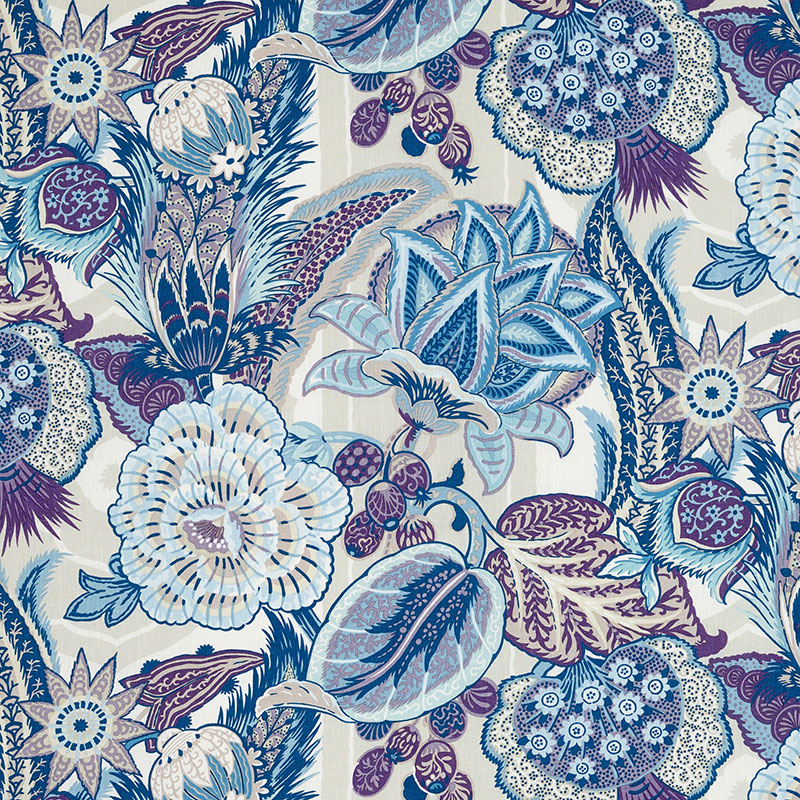
This Schumacher Cap Ferrat fabric is an example of a subtle way to infuse fruit and botanical prints into decor.

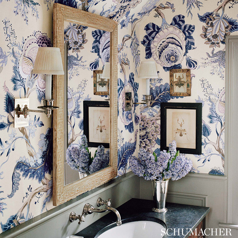
If you like to make a statement this Rifle Paper Company wallpaper evokes a modern yet vintage print style reminiscent of chinoiserie wallpaper… making quite a splash [photo: @moepark] .
We hope you have enjoyed learning more about this Mathe Design logo element and are encouraged to use it in your design style.
Cheers!
Melissa Mathe
*Contact mathedesign.com for all your Interior Design needs.


![CHLOE+|+Purple+[Casa+de+Perrin].jpg](https://images.squarespace-cdn.com/content/v1/57a36689cd0f68700167adc7/1515126556024-WTP9FNJR8NAN6GZMP4WH/CHLOE%2B%7C%2BPurple%2B%5BCasa%2Bde%2BPerrin%5D.jpg)